Have a go at applying what we've learnt to a website design outside of the workshop!!
For the first ten minutes or so, we are going to create the remaining 3 buttons in illustrator. The 'work', 'about' and 'contact' buttons.
These will be created in the same way as how we created the Home button in Workshop 02.
To add these to your website, first make sure that all your div open and close tags are aligned...
You now need to create a space ready for your next button...
Now you can add your next rollover buttons...
Obviously if this was for your actual web design, the buttons would be coherent, but as this is a test design I thought I'd try out a few different rollover ideas to see how it works on screen!
The following line of code is used to link something another page. The # means that the page is linked to nowhere.
To link your homepage button, type index.html in place of the #
To link your work button, type work.html in place of the #
To link your about button, type about.html in place of the #
To link your contact button, type contact.html in place of the #
These 3 pages don't exist at this moment of time, so we will need to create these!
You do this by pressing save as... and saving them as new documents called about.html etc
If you have done it correctly, when you click on the navigation buttons, you should be taken to new web pages!
What we've done so far is by far the hardest part of building a website! We now just need to add contact to the pages.
To lay text and images out, we need to create <div id>'s again. Everything has to fit together like a jigsaw to fit into the space given. It is important to plan everything out in advance.
In terms of the content area, as a class we decided on the following layout:
When you're dividing up a div id, you have 4 areas - the content, padding, border and margin. All the widths and heights that we indicate, will add up to the total of the container dimensions already created. For example, if the container is 618 high, you can have content at 518 high with padding above and below the content at 50 each. So this would be 518+50+50 = 618 pixels high!
Because we have decided to create a gutter of 50px, we will need to create separate padding id's rather than a general padding around the content.
For example, the gutter will need to have a padding of 25px as the two boxes will have the same padding around them - 25px times 2 will make the padding 50px like we want it to be!
You can then create padding to the left at 50px, to the top at 50px and then to the bottom at 50px.
This will all make more sense once it has been applied!!
Go into your stylesheet and create the following div id's:
By positioning the columns relatively, they are positioned next to each other rather than on top of one another!
Choose whichever page you want these columns to be applied to, I've chosen to work on the about page.
These two columns need to be within the container, so add the following code to this area:
Generate lorem ipsum to work it into the columns. go to lipsum.com and type:
Copy and paste the text into html, and then format your text so that you have two paragraphs.
If you add <p> where you want your paragraph break, it will create a break like so...
Adding a line break <br> you will get the following break between 'welcome to the about page' and lorem ipsum
a <p> break will make it look like this
You can change the font size and colour in the css code.
To add a header setting, type the following in css:
then add <h1> around the text that you want this to be applied to! </h1>
You can call this setting as many times as you want! For example:
To add an image, open up your chosen image in Photoshop. This image needs to be able to fit within the column space.
Go to image, image size...
Your image needs to be at least 437px wide when you change the ppi to 72. The resolution has to be 72ppi. Tick 'constrain proportions', and change the width to 437px. If the height is less than 541px, it's fine as this will fit within the column. The image can be the exact column size or smaller.
To save this for use on the internet, go to file, save for web...
save it as a JPEG and move the quality slider so that it is as low as possible but the image still looks good quality.
Make sure that you don't delete .jpg and name it without capitals, spaces or more than 8 letters. Save it in the images subfolder.
Then in dreamweaver, go to the page with the columns on and delete text from the right hand column so you can add your image.
If your image is as high as the column, then delete all the text from the column, but if not then you can just delete a small amount of the text to fit the image in.
Insert, image, choose your image.
Make sure that you call the alternate text something relevant to the image, I wrote cat.
If you want to use video on your website, use vimeo.
For example:
Or soundcloud for audio:
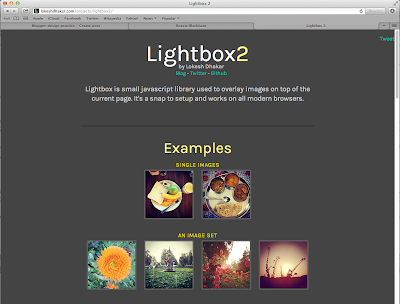
You can also use lightbox to overlay images on top of the browser page.


