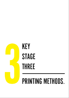
Going from my initial scamps, I decided to work on this idea as it's simple and clear. I need some sort of colour scheme for this to all work well though!
I decided to work with CMYK colour scheme, as you see these three colours being used over and over again when it comes to printing!
The 1 looks a bit distorted and squished...
I think the layout of the 2 needs adjusting and the line looks too long and weird..
The line across looks much better and the 1 looks better when the size hasn't been stretched!
I think this works quite well, as the design is becoming consistent across the books. I think once I have the basic layout sorted, the content will fit in quite easily!
I think that this design layout could quite easily appeal to teachers and their students as it's different to what you usually come across for school applied design. I think the background could be a bit more exciting though - maybe a pattern to get the children engaged?
I really like this idea, I also quite like how the circles stop where they do rather than covering the whole of the background. It makes the book seem more interesting and also relates to spot printing and lines per inch in commercial print.
I think it also looks quite nice with a subtle gradient down the pattern.
I made the gradient a bit easier to see - it looks almost as though the circles are disappearing into the background!
Is the font too 'shouty'? Would it work better in upper and lower case?
The font might just not be suited! What else could I use?
Cochin Regular?
Duolis SIL Regular?
I think that serif typefaces are a lot more suited for educational books for schools.
I think that these designs do look more professional and aimed at education / schools.
Task Ideas
Tasks could be laid out like this, but maybe the cat doesn't have any eyes so you have to potato print him some eyes?


