Simon's Photography Workshop Brief

by Roxxie Blackham on Friday 28 December 2012

☐☐☐☐☐☐☐☐☐☐☐☐☐☐☐☐☐☐☐☐☐☐☐☐☐☐☐☐☐☐☐☐☐☐☐☐☐☐☐☐☐☐☐☐☐☐☐☐☐☐☐☐☐☐☐☐☐☐☐☐☐☐☐☐☐☐☐

The brief that was set instructed us to take photographs of a particular shape around LCA and nowhere else.. Simon gave us all a particular shape each, mine was a square.

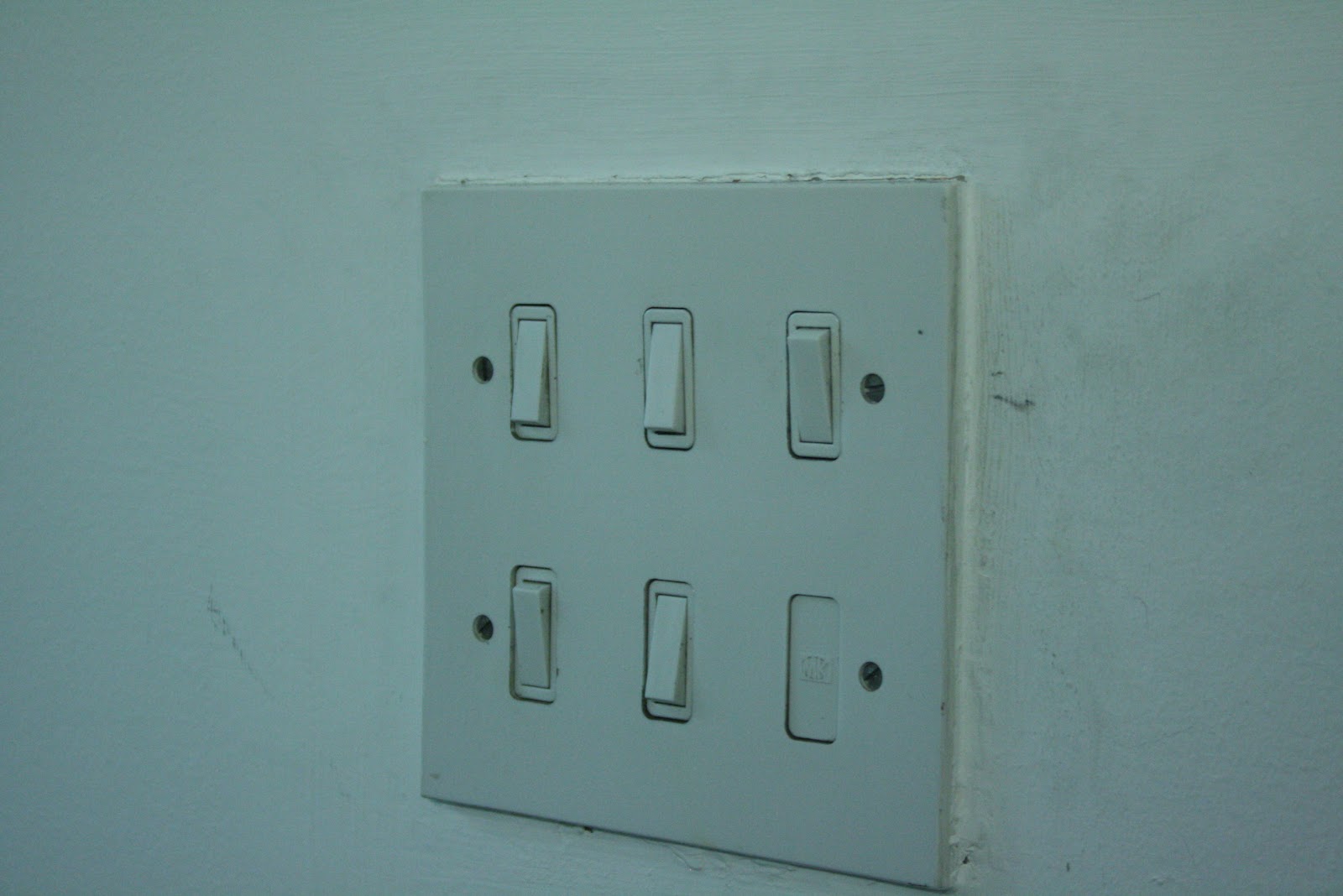
I decided to look at inanimate objects in the college that were square in their shape. I didn't really want to go for the obvious ones, for example - all of the square windows you can see around the university.


So I thought about the items you see everyday around the uni and just forget about, like the fire alarm buttons or the toilet door signs.


I then noticed all of the different types of light-switches that there were around uni, so photographed a variety of them, and then decided that I would use these photos of switches for my postcards and make the photos look a bit dirty and dark to give the switches a sense of slight feeling and emotion, rather than just being everyday light-switches. I wanted to make the light switches look as though they were sad and felt neglected.


☐☐☐☐☐☐☐☐☐☐☐☐☐☐☐☐☐☐☐☐☐☐☐☐☐☐☐☐☐☐☐☐☐☐☐☐☐☐☐☐☐☐☐☐☐☐☐☐☐☐☐☐☐☐☐☐☐☐☐☐☐☐☐☐☐☐☐

Research Into Postcards


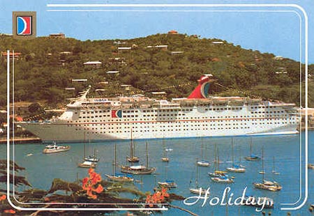
After researching into several postcard designs, it became quite apparent that typical postcards consisted of a full image filling the A6 format (usually of a holiday destination or something relevant to the place that the buyer visited) and then the postcard usually has a small amount of furniture decorating the edges of the postcard, and the odd word like "Holiday" or "Cornwall" or "Wish You Were Here". I also noticed that typical postcards are quite kische, tacky and cheap looking. You never really get a postcard that has been designed to be classy or something that you would keep because of how well designed it was! People usually tend to keep their postcards because of the nice A6 sized photograph and the memories that come with the little amount of writing on the back of the card.

☐☐☐☐☐☐☐☐☐☐☐☐☐☐☐☐☐☐☐☐☐☐☐☐☐☐☐☐☐☐☐☐☐☐☐☐☐☐☐☐☐☐☐☐☐☐☐☐☐☐☐☐☐☐☐☐☐☐☐☐☐☐☐☐☐☐☐

I decided that I wanted my postcards to look quite cheap and tacky so that they were similar to the postcards you often send to your friends, however I wanted to create a postcard that you wouldn't really decide to pick up and buy, because of the sheer thought that it seems quite irrelevant and weird. I thought the idea of taking photos of lots of different light switches made the postcard set quite humorous and different from other ideas people probably came up with.

However, I didn't really think the light-switches looked like a complete series yet, so edited them in photoshop to make them darker, more desaturated, and a little bit more eery...

Here are my 5 final postcard images:


When it came to designing the reverse side of my postcard, I really struggled with ideas. I didn't want to do anything really 'designery' and well laid out, because I wanted it to look like a stereotypical post card that you would buy and send to someone in the post. Therefore I went for a really simple design that you would usually see on a postcard, and found a squarish font to write the word POSTCARD on the top, like old postcards usually have written on them. I also added two little squares to go with my square theme. I also added a little bit of information about the set of postcards down the left hand side of each post card to make them seem a bit more serious and like they were made for a reason. I called my postcards "A Series of Lightswitches".


I don't really like the reverse design for my postcard, however I've never really liked the way postcards look anyway. At least if someone wanted to send one of my postcards in the post, they'd have plenty of space to write onto, etc which is the main function for a postcard. I also thought that the fact that the reverse side of the postcard doesn't really look very considered, helps to make it suit the front of the card and make the set of postcards seem quite kische. 


☐☐☐☐☐☐☐☐☐☐☐☐☐☐☐☐☐☐☐☐☐☐☐☐☐☐☐☐☐☐☐☐☐☐☐☐☐☐☐☐☐☐☐☐☐☐☐☐☐☐☐☐☐☐☐☐☐☐☐☐☐☐☐☐☐☐☐

Photoshop Workshop

by Roxxie Blackham on Thursday 6 December 2012

Look at how to get Photoshop to analyse lots of photographs of the same area and get rid of anything that moves...

Open up Photoshop, Go to: File-Scripts-Load files into stack...


Choose which photos you wish to load, 'check' the box next to "create smart object after loading layers" and press ok.  
You can 'check' the box next to "attempt to automatically align source images" if your photos weren't taken on a tripod, as the photos might be a bit wobbly and not in the same place. 'Checking' the box "create smart object after loading layers" will create one layer of all the separate photos, but you can still go back to edit the original.

 
The little icon on the bottom right of the photo shows that the image is a smart object.

Now go to Layer-Smart Objects-Stack Mode-Median...


This will get rid of everything in the image that moves..


However, the sky is just a blurry mess.. So if you want to get this back, go to the folder with the photographs in it, and look through the images until you find a picture where the sky is particularly nice. Take note of the file name.

File-Place-find image


Right Click on placed layer - Rasterize.


Use the quick selection tool to select the sky, don't worry if it is too precise or not as the buildings will stay the same. Then right click, select inverse and press delete.


 And now the sky should look pretty and better than the blurry mess we had before!


Contact sheets are useful, because they allow you to see the entire photos you could use as a set and analyse them all together.

File-automate-contact sheet


Under the Source Images section:
Use: Folder, then choose the folder with the images in it
Under the Document section:
Type in the dimensions of the document, for example A4 (21x29.7)
Make sure the resolution is 300ppi
The colour mode is RGB colour and bit depth is 8-bit
Under the Thumbnails section:
Place across first
Columns: 2 Rows: 2 and make sure that "Rotate For Best Fit" is 'checked'
Make sure that 'Use File Name as Caption' is checked, and you can change the font if you wish.


 Then Press Ok...


... and you will see that the images have been laid out next to each other, with their file name underneath (which will make it easier for you to find your images after you've chosen which are the best ones)

To create your postcards..

Create a new A5 document, and place in the photograph that you wish to use..

File, Save as..

Create a new folder called postcard1..


And choose the format to save the image as, for example TIFF


File Formats:
Lossy:
Screen based images (72ppi)
Saving as a lossy format will compress the images down and decrease the quality for printing.

Lossless:
Print based images (300ppi)
When you print something out you want it to look as good as possible, same goes for when you save something, as it will save it as the best image possible. However, this means that the Lossless image is a really large file.
Best file format for Lossless is TIFF

PDF:
If you save as a PDF, then any computer can open it, even if their version of creative suite isn't the latest version. This means that you don't occur problems like missing fonts etc when trying to open up the document for printing or presentation on a different computer to what you worked on.

Open up Adobe Acrobat Pro and press Combine Files into PDF..


Then choose the files that you wish to combine into a PDF file..


 Then choose to combine the files into a Large File Size (which is suibtable for high quality PDF and printing) and click combine files...


Then save the file as a PDF so that you can open it up with other software, not just Acrobat..


Then open up the PDF in Preview and print from there for ease!

OUGD405: How To...

by Roxxie Blackham

How to get people to communicate via talking...

THE BRIEF:
As a group of students you are to identify a problem from your individual research and provide an answer to it. You must resolve the How To... in an engaging and interesting way.

Background/Considerations
Who needs to know?
Students and teenagers
What/why do they need to know?
So that they can make friends easier when they start uni, and will also help them in their later lives
How will you tell them?
Via production of a pack of game cards that get the readers to take part in a fun way, using their voices and communicating with one another

You must identify whether you are trying to EXPLAIN, INFORM, INSTRUCT or EDUCATE the audience.
We are trying to inform and educate the audience

What will the audience respond to, where will they look? How will they need to interact with it? How will you know it is working?
They will respond to our presentation and a pack of game cards. They will interact with the cards, and we will know it is working from testing it out on piers and when using it in the presentation

What is the tone of voice? It must be appropriate to your subject, audience and method of delivery.
Informative, friendly and light hearted

We tried to work in a group of 5 to come up with an idea for this brief, however group members were easily distracted or didn't show up, and when we were together we couldn't decide on an idea as everyone wanted to take a different approach to the outcome, so we decided to split up into smaller groups within the group. I was partnered up with Rinesh.

Our Ideas

Informing people on the importance of communicating through talking
↳intimate
↳direct

Tone of voice
↳think about playfulness
↳ways of reading texts/emails in different ways, for example "what are you wearing tonight" could be read seriously or could be read in a seductive manner and will come across differently either way
↳ think of an aim...

≣≣ Informing people of how texts/emails aren't as personal as talking in person and you can often lose the meaning of the message ≣≣

For example:


Start off the presentation with definition of communication and talking etc?

Name: JARGON BEATERS
Idea: A set of 48 playing cards
         ↳for breaking the ice in Fresher's Week
         ↳come in a box like a pack of cards, maybe with a leaflet of instructions?
         ↳4 themes: erotic (rouge/pink/burgundy)
                            agressive (red/bold colours)
                            serious (grey/blue/white/black)
                            cheesey (yellow/orange)
         ↳stick to pastel colours so that the set of cards looks uniformed
         ↳12 questions per theme, which will make 48 cards
         ↳simplistic/minimalistic feel to them
         ↳symbols to represent each theme to create patterns for each card
         ↳logo should be simple and to the point. try to stick to a certain colour theme - blue and orange?
On presentation:
         ↳could record footage of a few people trying it out
         ↳ask for a few volunteers during presentation
         ↳make it seem like we're an association/company selling the product to the universities

"Thankyou for listening, now communicate"

Logo Design Initial Ideas:

We thought about making a circular logo with the letters JB within the circle, to stand for Jargon Beaters. It was hard to come up with something that looked good inside a circle when only using 2 letters..


We decided to abandon the idea of putting a shape around the letters, as it wasn't working well and we didn't really have any reason for the circular background. Therefore, we thought about the letters themselves, and how they would look nice next to each other on a page. We decided that we wanted our logo to have an uppercase J and a lowercase b..


We initially thought we'd use Helvetica to create the logo..


However, this looked far too formal and didn't convey the fun and light-hearted tone of voice that we were going for. We thought that it looked a bit too corporal and wasn't exactly what we were thinking of when we were coming up with the initial ideas. Maybe a different typeface would work better..


We had a look at a lot of san serif fonts, and came across Opificio. We really liked the letter J and how the b was curved round, this added playfulness to the logo and it didn't look so corporal anymore. However, we still weren't pleased..


Had a play around with the other fonts in the typeface Opificio - Opificio Rounded and Opificio Bold. We preferred the way the lowercase b was now ever more rounded and curved, but it looked a bit thin next to the really bold J. We also decided that the J should be filled in with the navy blue colour, rather than just having a blue outline..


The letter J looked a lot nicer in Opificio Regular, and it meant that it wasn't really bold and big when placed next to the b. We also took the stroke off the b so that it was cleaner and nicer on the eyes. However the logo still looks a bit too plain, and it's not obvious who the company are..


We thought about adding the rest of the company's name into the logo so that you could read who they were with ease. We liked the way the words 'argon' and 'eaters' were placed, however it meant that the b was lower down than the baseline of the J. We also thought that the logo was a bit boring and didn't really convey communication, so thought that we could include a speech bubble somewhere, maybe in the counter of the b..

Final Logo Design


This is our final design that we came up with. We had to alter the letter J as it was tapering slightly near the beginning of the curve. we also messed around with the thickness of both letters so that they complemented one another. We made the counter of the b into a speech bubble to help convey the idea of talking and communication, and lined up the words 'argon' and 'eaters' so that they were in line with each other and the letters. I am pleased with out final outcome, and happy with what I managed to produce for the project, as the logo design was mainly my job to create. I think the J could probably be altered with a bit more to make it completely perfect, if I were to create this logo again.

Final Pack of Cards

Rinesh designed the final set of game cards for our idea. I decided on the colour scheme and helped to create various parts of the designs, but it was mainly worked on by him, and I'm extremely impressed by the final outcome.

We had problems with printing the designs double-sided, so had to cut them all out and stick them together ourselves, however they still looked really professional!