
I had a look at the fonts used within Florence & The Machine artwork, and had a bit of a play around with the concepts of girly script writing, and the use of lines to create recognisable letterforms.
I really liked the font used for the logo for Florence & The Machine, but I thought that a typeface similar to this would be too obvious when trying to represent Anisha's personality, plus I couldn't rip off an already existing typeface!
I also really loved the font used on the Ceremonials album for the title.. So I thought if I played about with a similar idea to this, it could convey quite a lot of Anisha's personality - neat, loves florence and the machine, favourite food being fish (the lines remind me of fish bones), the idea of only knowing some of Anisha's personality, her creative side, and could also bring across her girly side..

Whilst thinking about how I could put across the idea of Anisha loving to eat fish, I thought about The Little Mermaid typeface, and researched into the different ways the title for the film was designed. I really love the letters designed as they remind me of the sea and also have quite a fantasy feel to them.
I had a little play with that kind of concept, and tried putting it with my previous idea of lines and half covered letterforms.

I fiddled about with the Little Mermaid concept for a while, trying to think of how I could create something that would show this in an interesting way, however I thought back to some previous concepts and thought I would try something quite different and not so obviously girly.
Tried creating letters out of fish scales, which really didn't work as I couldn't draw the scales properly! Also thought about making something similar to the gradient changes in the Obama Posters, which ended up looking like islands in the sea...
At the bottom of this page you can see 3 letters I made that I used David Foldvari's illustrations as inspiration for. I quite liked the idea of having parts of the letters drip and melt, but thought this would be hard to produce a whole alphabet dripping about like ink dribbling down the page, so scrapped that idea..

Going back to the previous ideas of The Little Mermaid and the lines constructing the typefaces, I thought I could try join the two ideas, however I thought this looked a bit too curly and average. The curls on the ends of the letters kind of ruined the rest of the idea!
The balloon illustration was taken from one of Foldvari's pieces, thought I could create something similar for Anisha's name tag.
The writing at the bottom was based on the Obama Posters, I really like that font, however didn't think it really represented Anisha so looked past it.

I tried experimenting with letters from the Arial typeface, going along the lines of my original ideas of combining works of David Foldvari and the Florence & The Machine Album Artwork.
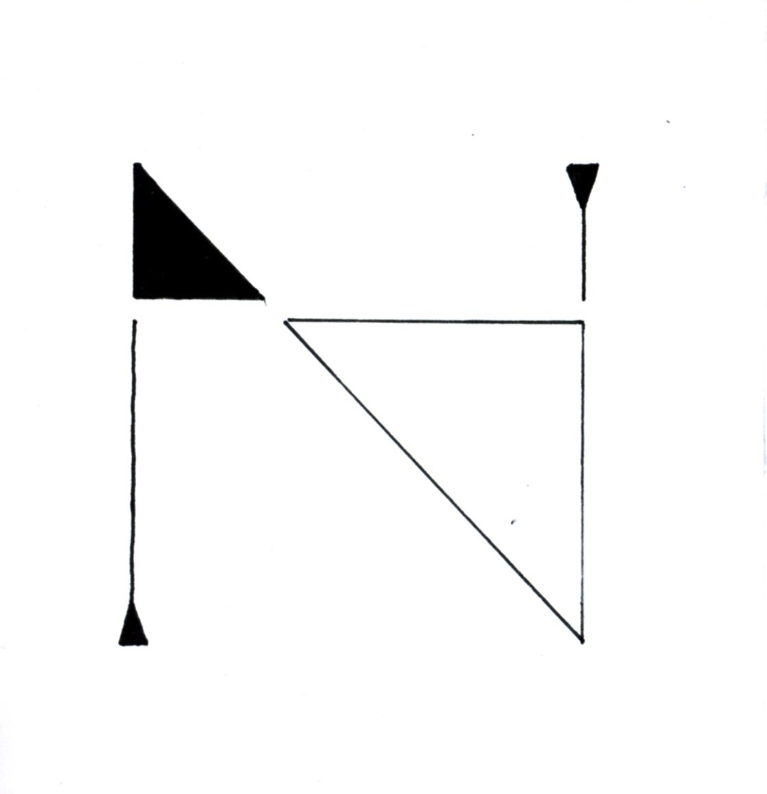
I thought I'd experiment with different ways of making the letter half legible with the use of stripes and white/black block colour.

After experimenting with some other letters, I realised that my typeface would work better covering up the left hand side rather than the right, as this makes the rest of the alphabet legible, rather than covering up some of the main recognisable features of the letterforms. I think this way I can stick to a grid with the letters, always working from the bottom left corner and making sure that the diagonal cover up is at the same degree each time.
Development of my typeface on A1 tracing paper.

.JPG)
.JPG)
.JPG) FINAL POSTER DESIGN.
FINAL POSTER DESIGN.I am really happy with my final outcome. I think the typeface works really well as a set as well as letterforms on their own. I think the idea communicates Anisha's personality well, and I'm happy that she loves the design as well. I think the typeface I created is well executed and aesthetically pleasing and meets the criteria of the brief.
APPLY YOUR TYPEFACE TO A NAME BADGE FOR YOUR PARTNER.

I found it difficult to apply my typeface to such a small area when Anisha's name was quite long, as you started to lose the detail and the lines were too thick in the stripes so it didn't have quite the same effect as before. I chose to add a silhouette of a bird onto the name badge to relate it to the work of David Foldvari, and I thought this would also appeal to Anisha more than just her name. I think my typeface works better when it's written in a larger point size, and wouldn't work as body copy.
ADD YOUR TYPEFACE TO AN EXISTING PRODUCT.

I decided to use my typeface with the Topshop logo, because I thought it would work extremely well as Topshop have created logo variations with very similar typefaces to the one that I created. I really like the outcome, it has made my letterforms seem more realistic and as though they are actually part of a set typeface. I think they work really well together when used in words, but I don't think my typeface could work in body copy - it's a lot more decorative and would be hard to read at a small scale.
- Leave your comment • Category: alphabetsoup, OUGD403
- Share on Twitter, Facebook, Delicious, Digg, Reddit
Dissecting Gill Sans.
I have decided to look into the Anatomy of Typography and how fonts and letters are designed and created. I find this area of Typography extremely interesting and thought that I would try to go down an unusual route whilst trying to convey the word dissection.
Scamps

I thought of lots of ideas that didn't really work very well but work as scamps and ideas towards my final ideas.
I think some of the ideas in my scamps contributed greatly to my other ideas, where as other ideas I came up with were just forgotten about as they were pretty rubbish.
I really like the ideas of using human body parts in my letter-forms as this will make the audience think of dissection and the insides of the anatomy, but I think the body parts will need to link into the idea of dissecting the anatomy of typography, otherwise it could just look really bad.

I really like the ideas of splitting the letter-forms up into chunks. I think this could look really good if I split all the different parts of the typography anatomy so that you can see all the areas and characteristics of the typefaces.
I also find veins really interesting and think that they could make some letters look really delicate and nice to look at. Veiny type could work really well as a whole alphabet as well or maybe just as a small part of each letter.
Idea #1
1st Attempt

Attempted doing something similar to some of the sketches of the design of Gill Sans, however the end result was really bad as the circles were so badly drawn and it was all quite out of proportion.. To improve on this, I could try using a compass to make the work more precise and accurate. I think adding veins to the letters will make it look more alive and dissected.
2nd Attempt

I really quite like this end result. You can see how Gill Sans created the letters O, G and Q in a very similar way with the same precise curvature etc. I decided to make it look a bit dissected and alive by adding veins that come out of the letterforms.
I think I could make it better if my hand was a bit steadier so that the circles stayed neat when i drew over the pencil lines, however I think this idea is effective and interesting to look at.
Idea #2
1st Attempt

I thought about creating a letter which looked as though it had been dissected or cut up into pieces. I didn't want to have the letter completely cut up so you couldn't decipher it anymore, but I think this attempt didn't work as well as it could have as the cuts look a bit weird and haven't come from the edge of the letterform, which would have made it look a lot more broken up!
2nd Attempt

I quite like this result as it looks a lot more cut up than the previous attempt. However, it looks a bit more broken/shattered than dissected... I think if I had printed off and traced the letter g instead of drawing free hand then the outcome may have been a lot better!
Idea #3

I thought about different materials that I could use to draw typography onto, and what better than the human anatomy itself? I really like this idea, I'm not sure how I can document it other than photographs as I actually used a needle and indian ink to tattoo an ampersand onto my wrist as I thought the idea of tattooing onto the human body is a form of dissection that you can see and is a permanent change to the skin.
Idea #4

I decided to draw a really simple outline of a tooth, which could easily be a letter M or W if the tooth was upside down. I was going with the idea of anatomy in typography so thought of parts of the human body that could easily represent type.
Idea #5

Looking at my research, I found typefaces made out of veins really interesting and aesthetically pleasing, so decided to create something similar to the ideas in my research. I really like this idea and think that it looks really nice and is quite a clever concept as it almost looks like the actual veins inside the construction of a letter A.
Idea #6

I think this idea works well as it looks as though the letter H has been cut up, or dissected, and I think the end result works quite well. It took me a few attempts to work out how to keep the letter-form recognizable but also make sure that it looks like a 3D letter that has been cut into chunks.
Idea #7

In this idea I tried to do something similar to the idea above, but keep the letter 2 dimensional instead of 3 dimensional. I think it works, but would look better in a set of letters rather than on it's own as it's a little bit boring. I'm not sure whether it would look better completely blocked in with black or not..
Idea #8

I really like this idea because it relates to the anatomy of typography idea again, and looks really nice at the same time. I tried to make the letter A look a bit like a pair of lungs. At first the letter wasn't connected up at the top, because I wanted to make the lungs look like the letter H, however this didn't work so I thought if I connected the letter then it would look like an A, which I think works out better overall.
Idea #9

Like the idea above, I was thinking of creating a letter made out of veins and body parts. I think this letter could probably work quite well with the letter A constructed above as part of a typeface as it's quite a similar idea. I really like using veins and think they make the letters look pretty and delicate. The eyeball at the top could be improved, but I'm not sure how..
Idea #10
I really like this idea, and I think it looks really nice, however I think the serif's should be more like usual serifs rather than like little triangles. It might look better with the bottom triangle coloured in instead, as this will give a heavy feel to the bottom of the letter so you know which way up it faces.
Idea #11

I think the second attempt to the above idea is much better and works a lot more. I think an alphabet consisting of lots of letters constructed like this could look really effective, however it's not completely obvious what the letters are trying to convey, and I don't automatically think of dissection...
Idea #12

I love this letter created of veins. I think it's aesthetically pleasing and easy to read. I think it would work extremely well in a set of letters all constructed in the same way. I really like using veins as they add fragility to the letter-forms and you also think of the human body when you look at the letters. I think it represents dissection well.
Idea #13

I think this is a clever idea as the S looks like guts, which makes you think of dissection or cutting a body up and revealing the intestines. It was hard to think of a way of making the intestines actually look like intestines, but I think it works quite well. I think if I could use colour, I'd add a bit of greeny brown or pink so it looks a bit more realistic.
Idea #14

I love this idea as it looks as though the letter T has been cut in half and it's intestines are spilling out because of this. I think it works really well and conveys the words dissection. I thought instead of using blood and guts, I'd make the blood ink, as ink is used to print typography or write it down, which I thought was a different but clever idea and makes it so that the type isn't completely human. I think this idea is really effective and aesthetically pleasing to the eye.
- Leave your comment • Category: alphabetsoup, OUGD403
- Share on Twitter, Facebook, Delicious, Digg, Reddit