Showing posts with label brief 2. Show all posts
Final Design Board After Alterations

I made each model rollover image on Photoshop before adding them to the html code.


I thought that the website needed some sort of background, as it looked a bit too plain!

I thought about using an image across the background, so tried a few different lavender field images to see what would work best.


I didn't like how some of the images had a white border on them, so altered the photoshop files and started again on the coding..


I didn't really think that the background image worked so well, so had a look for yet another lavender field image..

And then resized it to make it fit better with the images..

I also resized the advice page column so that it was more legible and not so text heavy..


My feedback was as follows:
- Yes it's very fashion / editorial style
- The website navigation is excellent, simple and user friendly
- Look at Elise Rose's blog - her work will suit your model page
http://elise-rose.com/home
- I think the advice page could be developed more and the home page text should be thicker
- I think the locational aspect of the site should play a key role as I feel this is something that could be genuinely useful
- I like how the navigation bar works throughout the pages
- I think horizontal scrolling would work well on the models page, but you may need to think how it will work though with the other pages that use vertical scrolling. It may not work due to this.
- I definitely think the 'informal' tone of voice you have used for the site will appeal to the target audience, the content is also appropriate
- The design you have used also has a very 'editorial' professional feel, which is appropriate for the audience
- The navigation bar is clear on every page which makes the site easy to navigate through
- I would use horizontal scrolling on your models page as I think that layout would be more similar to the layouts, therefore creating a sense of continuity
- To improve the site I would just add as many models / photographers / advice as you possibly can which I know you have begun to consider
- It looks very editorial, especially due to font colour and choices. I like the navigation bar as it's simple, but sophisticated.
- The website is very easy to navigate, and you've made it easy for yourself to update the images to a new photographer, again layout is simple and easy for the audience, there is a good balance of whitespace and images / text
- I think that horizontal scrolling would work best and I like how the information of the models appears when you hover over the image
- I think that the wording on the about page needs changing, you don't or shouldn't really need to state who it's for as obviously. I also don't think the audience would say 'nab' and you should perhaps start with the end sentence about being outside - I think that's an interesting statement and it's different, otherwise you've explained the site very clearly!


Using the coded website pages, I created a few mock-ups to show how they will look when full-screened on an iMac...


- blog about all your mistakes
- buttons will increase options available to you, e.g. you could put a quote on the homepage of the website that links onto another article on the internet that is relevant to your topic
- make the text 'fixed' and it should become responsive across all screens, if you're working in pixels!
- how can you bring the nag bar across all the pages to keep it subtle and transparent?
- how can you navigate from page to page whilst keeping it simple yet coherent?
- create another flow diagram for how your website will work now
- gather survey feedback and blog it - create charts?
- keep your colour palette simple - blog colour scheme choice
Remember target audience
Consistent navigation
Tone of voice
Pixel count in scamps
Colour palettes - RGB values
Mobile templates
Margin padding and sizes
FINAL CRIT - 10th DECEMBER

I followed my workshop notes to create the very basic layout of my website and how it could possibly look. However, I encountered various problems.
1. As we learnt how to position our navigation bar at the top of the page, I didn't understand how to position it to the left hand side of the page and keep everything else working around the page.
2. Because of the first problem, the body text wouldn't stay where I wanted it to without being in 'fixed position'. This meant that the rollover buttons didn't work anymore.
3. If I tried placing the body text in 'relative position', then the text either disappeared or positioned itself at the bottom of the page.
4. The home page button became distorted and stretched when I rolled over it.
5. The background is too plain for the homepage - would look better with an image filling it.
DESIGN IDEAS


I really liked this kind of approach for the homepage for my website. It really suits the theme and will appeal to the target audience. However, the logo looks really weird and out of place - a bit unnecessary.

I think it definitely looks more professional without the logo in the navigation bar!

However, when I tried using this photo in Dreamweaver, it looked a bit too much like the layout for a fashion blog. I need an image that is big enough to cover the entire background and doesn't become pixelated!

(The images I used are all supplied by http://www.victoriacadisch.com - Victoria is my housemate's sister and has allowed me to use her images and advice for content on my website!)

I found that this particular photo definitely works a lot better for the homepage as the model is quite alluring and makes you want to look at other pages of the website.
Problems I encountered:
1. The web name placed itself at the bottom right of the page
2. The navigation bar ended half way down the page

I managed to move the title over to the left hand side, however it was still too low down and looked awkward on the page.

The title definitely works better higher up, however the sub text looks awkwardly placed and needs moving down...

I finally managed to get the text to sit in a better layout, however the navigation problem was still there!

Sorting out the size of the navigation bar was really easy, however the buttons had become slightly transparent due to the opacity I added to the bar..

I tried so many things to solve this, but everything didn't work..

I changed the colour of the buttons and the background navigation bar to see how that altered the look of the website, however I still couldn't figure out this opacity problem!

Changing the opacity of the buttons didn't work. I eventually cheated my way around the system by creating another div id that could be placed over the top of the navigation bar so that the buttons didn't become transparent, and voila!!
I also had trouble with the background image filling the page completely, rather than having white borders on the edges - but I managed to solve this with a bit of lucky coding!

However, I was still finding the typography frustrating and badly placed.

Altering the container boxes helped to make the title read on one line, but this moved the other type all the way over to the right of the page!

I managed to pull this type in with a lot of trial and error modifications - so happy that it aligned itself with the edge of the bed head!


I used a really simple set of grids throughout the layout of the pages, so that the layout stayed consistent across the pages. This also made it easy to think about how my content could work on the pages in a clean and clear way.


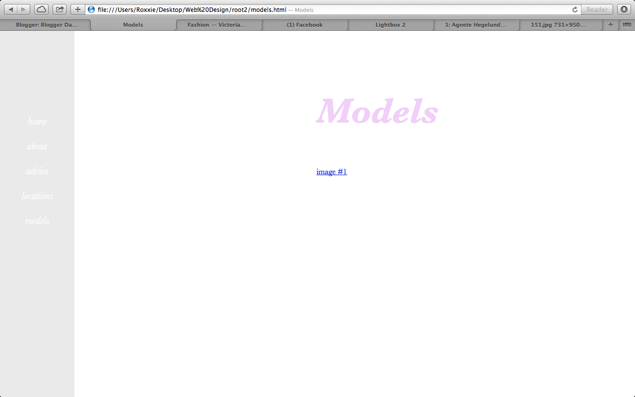
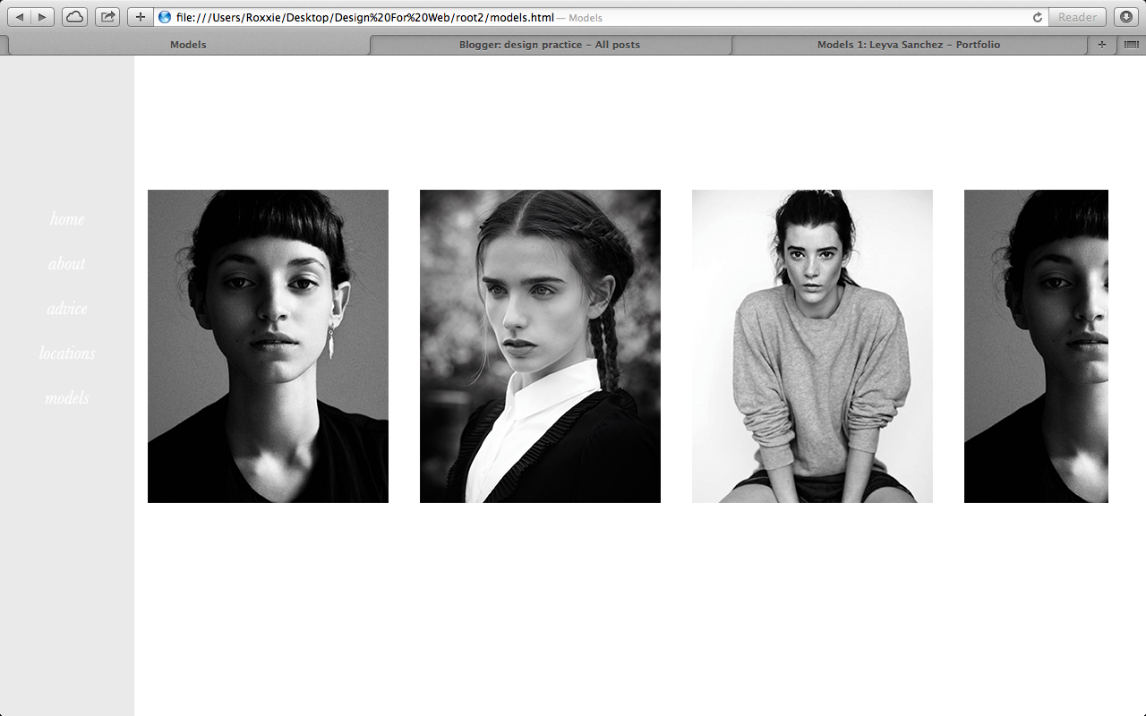
I want my models page to scroll horizontally so you can flip through each model's picture and then find their link to their portfolio - either by clicking on the photo of the model, or it could be written underneath their images.


I realised that when I make my web browser smaller, a lot of the text disappears from the page, so thought I'd attempt to resolve this!

However, no matter what I tried, I couldn't figure it out!!!!
So I decided to leave it for now and create the about page..


I didn't really like the basic layout that I had previously gone for - it didn't suit my audience!


Messed about with the padding pixels to create a space between the two bodies of text..

I thought that the page needed some imagery, so found one of Victoria's photos that I like and placed it across the background of the right content box..

Took the text away from above the image, as it looked really awkward and out of place..

Thought I'd see how the website looks fullscreen..

Changed the font styles for the header and body text to make it suit the concept idea..


The body text didn't work italicised..

The body text also looked really blocky and big at 18px.

After a lot of altering, I found the right size of body text for the about page.. It still seemed to bold though!


However, I didn't like how the left hand navigation bar didn't have an image behind it! My favourite part of the homepage was the translucency of the navigation bar and how it worked above the image behind it. So I moved all the text over to the right..

I then thought that maybe the title could work on the left?

I added an image to the left hand side of the background..

And this happened!

However, it still didn't look right! So I thought I'd see how the image looked when it was bigger - but then this became pixelated!

I tried various sizes, but the image kept repeating itself to try and fill the background..

So I made the image even smaller, still repeating the image..

Suddenly realised - type 'no-repeat' in the css and see what happens? Et Voila!

The image didn't fill the whole of the left hand side, so I changed the sizing..

However, I didn't feel as though that image worked very well with the design aesthetics, so chose a new one..

I moved the title over to the right hand side as it didn't look right overlapping the image..

Altered the right hand container size so that the text filled more of the page..

Moving onto Advice & Tips..
Using the same coding, I added a picture of Victoria Cadisch instead of an image of her work - Victoria sent me this image to use on my website..
I also changed the text in the title section..

I then played about with the size of the photo of Victoria - I wanted it to fill the page like before, but within a certain width..

I had a lot of problems with getting this image to work, as the original file was square in size.

It took a lot of trial and error until I managed to get something to work for me!

I altered the body text on the page, to take my mind off the image not working..

Messed around with css coding to make some new font styles called <h5> and <h6>..
I also worked out how to make the body text lighter in weight! So changed this across my body text on the other pages..

Sometimes there were too many line breaks / paragraph breaks..


I also noticed that I was going to run out of space for my whole interview with Victoria.. How could I make this page scroll?!?!?!

So I decided to try and work on the image of Victoria to make it fit onto the page similar to the image on the about page..


Brainwave
I thought - why don't I crop the original image?
This solved the problem!!!

I then edited some of the dandelion seeds out of the original photo, so that it didn't interfere with the text in the navigation bar..

I also managed to figure out how to create a scroll bar! This solved my problem with no space for content, and made the website so much more professional..


I went back to the about page and edited the text on there so that the weight was lighter..