Showing posts with label studio task. Show all posts
In groups you will create a concept for either a new / fictional bar, restaurant or hotel in Leeds.
You will select 3 words from Jar 1 and one word from Jar 2. Then you will decide on which word to work from in Jar 1.
You will present your ideas tomorrow at 11am.
Think about:
- Client's needs
- Who is your audience?
- What is it's purpose?
- Potential / current customers, volunteers, students?
Push your concepts as far as you possibly can!
Out 1 word: hotel


- Leave your comment • Category: brief 1, OUGD504, studio task
- Share on Twitter, Facebook, Delicious, Digg, Reddit
We were asked to break down the logos everyone brought in, to find out the concepts behind the design...
Original NASA Logo:

- Made in the 80s
- The use of red signifies danger, as well as patronism to America
- The typeface looks futuristic - clear and easy to read from a distance. Made to look like tubes to infer the idea of going into space in a shuttle. The A's look like the top of the shuttles, and as though they're shooting upwards
- The A and the S are linked. This intends to convey different messages to the audience. It intends to be broad and could mean "astronaut and space" or "astronaut and shuttle" etc.
- NASA were rebranded, because the original logo was associated with people dying due to the Challenger accident when 7 people died

- Use of yellow signifies hunger, according to the study of psychology
- Good use of negative space, forming the fork in the face
- Cheetah's are known to be fast, so it signifies the speed of the food you receive

- Curved F signifies aerodynamics / the shape of the car, spoilers or the curves of the roads
- Use of the colour red signifies danger in the sport
- Italicised typeface signifies speed

- Lack of typography used is clever as it fits to the name of the brand
- The letters link together really well
- Elegant and expensive feel - targeted towards the female audience
- Feminine touch - serif typefaces tend to be more feminine than masculine
- The circle around the heart signifies protection
- The circle could also signify targeted health services
- The colour blue is associated with depth and stability, so helps to make the health service seem reliable, stable and professional. Blue is also considered beneficial to the human mind and body - producing a calming effect and slowing metabolism. The colour blue also relates to cleanliness and hygiene
- Light blue is associated with health and healing

- Small logo, because of the fact that sushi is small and Japanese love small things
- The fish image placed on top of the writing signifies the making of sushi
- The idea of Karma Sutra can be related to this logo, as the fish have been placed in what could seem a Karma Sutra / sexual position
- The colours red and white signify the Japanese flag

- Performance drink - rabbit associated signifies that it keeps you going (like the story of the Hare and the Tortoise)
- The heart is in the logo, as the company are selling the drink with the idea of fitness, rather than a burst of energy. This also relates to the idea that they bottle their drink in bottles, rather than cans - you can carry on drinking it through the day, rather than quickly and finishing the can
- The colour black is more versatile, and the negative space is more visible on different backgrounds
- The secondary colour red signifies thirst, signifying drinks
- Aimed at people who aspire to be athletes
- Aimed at females - looks similar to the play boy bunny, plus girls love rabbits and hearts
- Aimed at the younger generation as they're more likely to drink energy drinks. Also, people in their 20s or 30s tend to feel as though they're not so youthful
- The logo needs to be scalable
- The logo needs to fit onto a computer screen well
- It needs to last for years. Geometric forms tend to have more of a "shelf-life" and are iconic
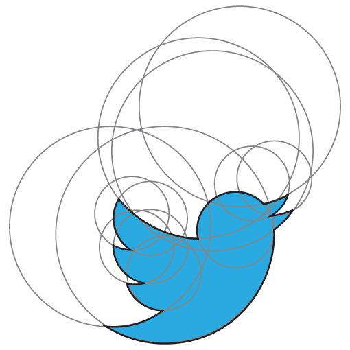
- The circles could also relate to your circle of friends that you connect with on Twitter
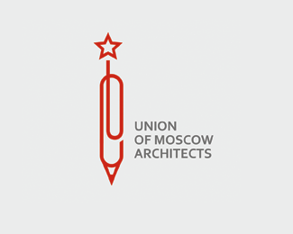
- Being designers, they wanted to reflect the design side of the company and steer clear of the obvious Russian design routes that they could have gone down. The design is accessible to anyone, and shows a modernistic feel
- The pencil is made out of a paperclip - this could show the unity of the company as well as the fact that they are designers
- The star at the top will signify the fact that they're Russian and relates to communism
- Apple
- Formula 1
- Nexcite
- Lack Magazine
- My Fonts
- Bison
- EE
- Leave your comment • Category: brief 1, OUGD504, studio task
- Share on Twitter, Facebook, Delicious, Digg, Reddit
In a group, discuss:
What is format?
- scale
- something physical eg, a magazine or billboard etc
- function
- context
The format is the physical object that has been designed.
What is colour?
- RGB & CMYK
- processes eg, flourescent inks
- connotations of colour eg, different cultures
- colour harmony / theory
Colour is considered for both function and connotation.
What is production?
- physical production eg, paper cut, book binding, etc
- can be more of a craftsmanship / skill
- possibly more broad than processes
- bringing all the elements together
- final part?
Production is a type of craft or skill.
What is a process?
- stamping, embossing, screen printing, collagraphing, etc
- a process of printing
- mostly to do with print
- "on the way"
- preparation
Processes are mostly related to printing, and how the ink is transported onto the stock.
What is a finish?
- spot varnish, foiling, etc
- considered before print, but the last thing you do to finish the design
- helps to makes something seem like it is of a higher quality if a good finish has been added
- consider the cost, stock, audience
The finish is something added at the end of a design, that is determined by the stock, cost and effect on the audience.
What is stock?
- types of material to be printed onto eg, paper, card, tracing paper, plastic, wood, etc
The stock is the material which you print on to.
Colour: Colour modes, hues, function, etc
Production: "The actual making of it"
Process: The method of doing it all - all the steps along the way
Finishing: "Post print alterations", production and process in one
Stock: Substrates for printing, considerations e.g. cost and audience
All the processes are linked together.


- Leave your comment • Category: brief 1, OUGD504, studio task
- Share on Twitter, Facebook, Delicious, Digg, Reddit
Within your summer project groups, debate the following question:
What is design for print?
- You have to consider the printing process before designing
- Consideration of format and layout
- Easy way to mass produce your design
- Examples of design for print: books, posters, zines, leaflets, postcards, stationery, billboards, packaging
- Processes of design for print: screen print, laser print, 3D, ink jet, lino, foiling, collagraph, lithograph, potato, etching, stamps, letterpress, textile, embossing, laser cut
- A design that intends to be physical
Can you sum up the answer to the question in one sentence?
A design that intends to communicate a message in a physical format with image and/or text through the process of printing.
In a way, it is impossible to define as printing processes and the designs themselves are so broad. There is no right or wrong answer.
6 categories to look into:
- Format
- Colour
- Production
- Processes
- Finishing
- Stock
1. Format


2. Colour


6. Stock

What 3 printing processes do you, as a designer, want to explore this year?
1. Letterpress
2. Screen Printing
3. Etching
When you're designing for print, it's finite information and can never change. Whereas when designing for website, you can always change that information. You cannot ever retract information that has been printed.
Bring in 5 physical examples of print next Tuesday. Keep them varied.
My Objects:

- Leave your comment • Category: brief 1, OUGD504, studio task
- Share on Twitter, Facebook, Delicious, Digg, Reddit