Showing posts with label OUGD403. Show all posts
- Leave your comment • Category: OUGD403, responsive
- Share on Twitter, Facebook, Delicious, Digg, Reddit
1. What skills have you developed through this module and how effectively do you think you have applied them?
I think that my skills on illustrator have definitely developed through the workshops we had, and the process of constructing my typeface has helped me learn how to use the pen tool to it's full potential. I also think that my research and development skills have improved throughout the term and I'm finally coming to grips with how to use my blog effectively.
2. What approaches to/methods of design production have you developed and how have they informed your design development process?
I think I've developed my use of fine-liners and inks during my design process, and the use of these black inks and pens has definitely helped me produce my final typefaces as the limit of colour meant that I paid a lot more attention to detail and the general idea I was trying to portray. I think I have approached my designs differently to how I usually would by limiting my resources, which has helped me to come up with strong concepts.
3. What strengths can you identify in your work and how have/will you capitalise on these?
I have identified that I have a strong eye for detail and have also noticed that I can draw out typefaces pretty accurately and sometimes spot on. I applied these strengths to my typeface designs, concentrating on every little detail of each letter so that the typefaces are consisted and almost perfect. I think my attention to detail also helped to create my poster designs to their full potential and I'm extremely proud of the work I've been producing.
4. What weaknesses can you identify in your work and how will you address these in the future?
In all honesty I have noticed my main weakness is keeping on top of my blogging and have became better at this as time has gone on. I think this will eventually become second nature and I won't get so stressed and worried about it as I'll know that I'm doing it correctly and thoroughly as my skills start to pick up.
5. Identify five things that you will do differently next time and what do you expect to gain from doing these?
- Blog every night so that I am constantly up to date. This will ensure that I am more relaxed about what I still need to do and will also help to improve my blogging skills gradually.
- Spend extra time coming up with ideas so that my development sheets are more impressive and at a larger quantity. This will also develop my skills in coming up with good ideas.
- I think next time I'd like to experiment with various types of stock for printing on, as this choice of stock often improves designs immediately, because they add texture and a new colour which you hadn't previously thought of.
- Experiment with crafts and paints when creating final pieces rather than ordinary use of pens, pencils and computers. This will show more development and ideas for assessment, and I could also end up with stronger ideas than before.
- Research into ideas in more depth as this can often strengthen ideas that I have already come up with, but can also help to come up with completely different ideas than before (also visit the library more often for research).

We were asked to create something to send out in the post that related to the 3 posters on our chosen article. The mail-shots had to fit into a DL envelope which you could also create yourself so that it related to your previous ideas and concepts. Once again your designs were limited to the 2 colours and stock that you chose before and had to be in the same style so that they depicted your other designs.
INITIAL THOUGHTS AND IDEAS
So that my mail-shots and envelope fitted in with my other ideas, I wanted to keep them as simple and to the point as I possibly could. I didn't want a lot of information crammed into a small amount of space, and I wanted the designs to look really similar to the poster designs in layout and format.
I decided that I was going to create something not to inform the reader about what the Female Engagement Team do in Afghanistan, but to encourage them that joining would benefit them and would be a good idea. I decided to do this through questioning the audience rather than just supplying a lot of facts and information they probably wouldn't even read or take in.


I think that just sending out information about what women did in the war and what the Female Engagement Team was would be a bit too plain and wouldn't really be that engaging for a lot of women, so instead I thought I would produce some sort of flyers to encourage more women to take part in the war in some way.

The use of circles is quite common throughout my poster designs and I thought that creating a leaflet to go inside the DL envelope that incorporates the shape of a circle somehow, whether the leaflet is actually the shape of a circle itself or has a lot of circles in the design, would keep the consistency and would relate to the simplicity and use of circles in my poster designs.

Once again I went along the idea of using circles, but thought that the pages would need to join up in the leaflet, therefore the circle won't be a full one as one side will need to be straight to make the booklet work. The information and image in the booklet would need to be minimalistic to relate to the poster designs previously created.

The concertina concept could work quite effectively as you can get a lot of information onto a small amount of space that folds up to make it more like a leaflet to read. The concertina could have lots of different type along it, or could fold out to make an image that represents the Female Engagement Team.

Obviously if I were to create a leaflet, flyer or booklet that encourages the reader to join the army, they will need something to either fill in and return or a website to follow onto so that they can apply that way. I think creating a form to fill in could work well, however it means the reader has to then post it back to the company, where as applying online is more convenient for the masses. Plus applying online means that the reader can then find out more information about what they're applying for and means that they can decide for themselves without feeling pressured to send the form back.


I spent quite a bit of time thinking about typeface styles that would work well with the several concepts that I had come up with so far. My favourite choices were either stencil styled typefaces or gothic ones. I really liked the sans serif, slightly curvy fonts, because of the simplicity and fragility of each letter. The only problem is that they're that simple they won't "scream" war or females when you first read the words. They also don't grab your attention quite as easily as said stencil typefaces.

Going back to the ideas that I came up with for my poster designs, I think that creating the word RECRUIT in the same way that I created the word WAR in my type & image poster would form a sense of cohesion and will make my mail-shots relate well to my poster designs effectively.

Following the idea of using the word RECRUIT made up of flowers, the back of this flyer could be simply an application form for the army, or maybe just a few rhetorical questions to get the reader considering about how they can make an impact on another woman's life. I really like the idea of using language to form a feeling of guilt in the reader's mind as they ponder over the sentences. I think this would be the most successful use of dialect in my design.
FINAL IDEAS
DL Envelope Design


I really like my final envelope design as it is really minimalist and straight away relates to women by using the symbol of venus (♀), which you automatically depict as as sign of women or femininity. I stuck to the previous design themes by the use of colour, lines and flowers. I think the flower pattern that was used in the WAR poster works really well lining the inside of the envelope. The simple use of flowers gives the envelope an immediately delicate and feminine touch and works really well with the stock and colours used. I chose to put the flowers in the circle of the symbol of venus as I thought the colours would compliment the golden colour of the first class stamp, which works extremely well! I really love my envelope design, as I find it extremely aesthetically pleasing and is definitely made to my personal taste, and I think a lot of females could easily feel the same way about it.
Designs For Flyers Inside The Envelope


I decided that even though my flyers would need quite a bit of information on them about what the women could take part in, I thought that if I just asked the reader a few questions and then told them what to do next, then they actually had the choice whether to look further into the cause or not, rather than just bombarding them with information that they may not even be interested in.
My initial intentions were to create a double sided leaflet to put inside the envelope, however it didn't go according to plan and a lot of money was spent on printing my designs trying to get them in line on a double sided page, failing every time. So I decided to just go with two separate flyers, which I think works just as well and may even make the audience feel as though they got more in the letter than they actually did.

I decided to send my mail-shots to various schools, colleges and places where girls are likely to be and have the opportunities to gain experience of what joining the army could be like (for instance they could join CCF at school and gain useful experience in army training which could encourage them to join the army). The reasoning behind choosing to send one of my mail-shots to Girlguiding UK was the fact that at guides you learn all sorts of skills in various areas of life, and are constantly encouraged to help others, therefore working for the Female Engagement Team would be a perfect career choice for someone who wants to get involved and help other women as much as they possibly can.
I think that my mail-shots, DL envelopes and mailing list work really well together and compliment the posters perfectly. I am really happy with my final results and actually really proud of my work for this project seeing as we had a short amount of time to achieve something worthwhile. I think that if I were to redo my designs in any way, I'd probably choose an alternative font to the one I used for my body copy and text throughout my designs, as it was a downloaded font on my macbook so wasn't recognised on other macs which was annoying. Also I think the font itself is almost wobbly in a way, and sometimes looks as though it doesn't sit on a straight line. I'd also possibly consider sending my mail-shots to some other organisations where there are plenty of women, maybe of an older age range than schools and colleges.
- Leave your comment • Category: mail-shots, messageanddelivery, OUGD403
- Share on Twitter, Facebook, Delicious, Digg, Reddit
Initial Ideas.
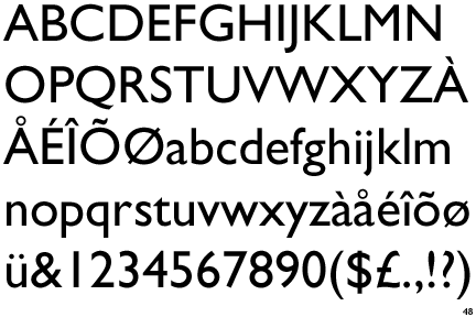
I have decided to use Gill Sans as the typeface to work from, as I thoroughly enjoy this font, and know a lot about Eric Gill. I think it's a simple and effective typeface and looks really nice!

Source For Image
Things To Think About:
- Think about ways of dissecting Gill Sans
- Create 10 of the letters with parts of the human anatomy?
- Turning Gill Sans into a veiny typeface could look really nice, especially if it's really detailed and intricate
- Pull apart all the characteristics of the font. Look into Anatomy of Type and dissect the font into lots of parts of gill sans maybe?
- Draw Gill Sans in 3D style and make it look like the letter-forms have been dissected and cut open - add bits of flesh, bones and blood into the letters

Source For Photo
I think "dissecting" each letter-form so that you can see how they were created could look really good and would be extremely interesting. This would also add texture to each letter as they would have to be created on graph paper for precision and accuracy.
Illustrator Typeface
I think that Gill Sans would also be an easy font to work from for my illustrator typeface on dissection, as it's simple and clear and also aesthetically pleasing. I also think it would be easily manipulable.

I initially thought that I was going to use this idea for my illustrator typeface, as it came out as the best idea in a group crit, however when it actually came to making this work in Gill Sans and 3D format on illustrator, this became quite a difficult task that I couldn't get my head around easily! So I thought I'd go for the one idea which would be easiest to combine with the chose font.

Instead I decided to go with something along the lines of this idea, as I thought it was aesthetically pleasing and related to the idea of typography having an anatomy. The one thing I found difficult was making this look like veins on illustrator, as it's hard to get the same effect that you get when using a pen (thicker and thinner weights in the lines and the delicate look that the veins have when drawn with fineliner)
I really loved the way all the veins started from the bottom left of the letter when I designed it with a fineliner on some paper, so thought that I could try doing this with every letter of the alphabet when I designed it. Obviously in some cases this would be difficult as not every letter has a bottom left corner to it, so I would have to start it from the bottom of some letters, for example the O.


- 7 comments • Category: alphabetsoup, OUGD403
- Share on Twitter, Facebook, Delicious, Digg, Reddit
OUGD403: Women At War Poster Development and Final Ideas
by Roxxie Blackham on Wednesday, 7 November 2012


The thought of Propaganda posters used during World War 2 made me consider how I could use the theme in my work, but in a way that represents the need of females in the army.


I really like the idea of creating a pastiche of the "We Can Do It" poster, but incorporating the slogan that I eventually decide on about the use of guns and sexism in my design work. I also think that changing the O in YOU to a symbol of venus is extremely effective and portrays the message efficiently and quickly to the reader. I feel that either of these two ideas could work for the image and type posters and both obtain an aesthetically pleasing nature.


- Leave your comment • Category: messageanddelivery, OUGD403, posters
- Share on Twitter, Facebook, Delicious, Digg, Reddit

I had a look at the fonts used within Florence & The Machine artwork, and had a bit of a play around with the concepts of girly script writing, and the use of lines to create recognisable letterforms.
I really liked the font used for the logo for Florence & The Machine, but I thought that a typeface similar to this would be too obvious when trying to represent Anisha's personality, plus I couldn't rip off an already existing typeface!
I also really loved the font used on the Ceremonials album for the title.. So I thought if I played about with a similar idea to this, it could convey quite a lot of Anisha's personality - neat, loves florence and the machine, favourite food being fish (the lines remind me of fish bones), the idea of only knowing some of Anisha's personality, her creative side, and could also bring across her girly side..

Whilst thinking about how I could put across the idea of Anisha loving to eat fish, I thought about The Little Mermaid typeface, and researched into the different ways the title for the film was designed. I really love the letters designed as they remind me of the sea and also have quite a fantasy feel to them.
I had a little play with that kind of concept, and tried putting it with my previous idea of lines and half covered letterforms.

I fiddled about with the Little Mermaid concept for a while, trying to think of how I could create something that would show this in an interesting way, however I thought back to some previous concepts and thought I would try something quite different and not so obviously girly.
Tried creating letters out of fish scales, which really didn't work as I couldn't draw the scales properly! Also thought about making something similar to the gradient changes in the Obama Posters, which ended up looking like islands in the sea...
At the bottom of this page you can see 3 letters I made that I used David Foldvari's illustrations as inspiration for. I quite liked the idea of having parts of the letters drip and melt, but thought this would be hard to produce a whole alphabet dripping about like ink dribbling down the page, so scrapped that idea..

Going back to the previous ideas of The Little Mermaid and the lines constructing the typefaces, I thought I could try join the two ideas, however I thought this looked a bit too curly and average. The curls on the ends of the letters kind of ruined the rest of the idea!
The balloon illustration was taken from one of Foldvari's pieces, thought I could create something similar for Anisha's name tag.
The writing at the bottom was based on the Obama Posters, I really like that font, however didn't think it really represented Anisha so looked past it.

I tried experimenting with letters from the Arial typeface, going along the lines of my original ideas of combining works of David Foldvari and the Florence & The Machine Album Artwork.
I thought I'd experiment with different ways of making the letter half legible with the use of stripes and white/black block colour.

After experimenting with some other letters, I realised that my typeface would work better covering up the left hand side rather than the right, as this makes the rest of the alphabet legible, rather than covering up some of the main recognisable features of the letterforms. I think this way I can stick to a grid with the letters, always working from the bottom left corner and making sure that the diagonal cover up is at the same degree each time.

.JPG)
.JPG)
.JPG) FINAL POSTER DESIGN.
FINAL POSTER DESIGN.I am really happy with my final outcome. I think the typeface works really well as a set as well as letterforms on their own. I think the idea communicates Anisha's personality well, and I'm happy that she loves the design as well. I think the typeface I created is well executed and aesthetically pleasing and meets the criteria of the brief.


I decided to use my typeface with the Topshop logo, because I thought it would work extremely well as Topshop have created logo variations with very similar typefaces to the one that I created. I really like the outcome, it has made my letterforms seem more realistic and as though they are actually part of a set typeface. I think they work really well together when used in words, but I don't think my typeface could work in body copy - it's a lot more decorative and would be hard to read at a small scale.
- Leave your comment • Category: alphabetsoup, OUGD403
- Share on Twitter, Facebook, Delicious, Digg, Reddit