Initial Ideas.
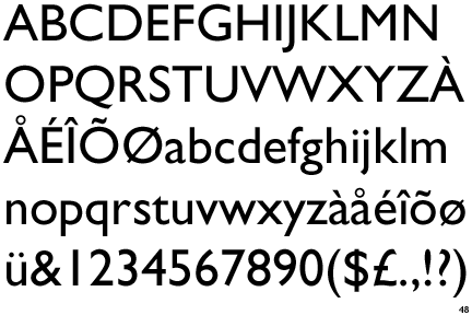
I have decided to use Gill Sans as the typeface to work from, as I thoroughly enjoy this font, and know a lot about Eric Gill. I think it's a simple and effective typeface and looks really nice!

Source For Image
Things To Think About:
- Think about ways of dissecting Gill Sans
- Create 10 of the letters with parts of the human anatomy?
- Turning Gill Sans into a veiny typeface could look really nice, especially if it's really detailed and intricate
- Pull apart all the characteristics of the font. Look into Anatomy of Type and dissect the font into lots of parts of gill sans maybe?
- Draw Gill Sans in 3D style and make it look like the letter-forms have been dissected and cut open - add bits of flesh, bones and blood into the letters

Source For Photo
I think "dissecting" each letter-form so that you can see how they were created could look really good and would be extremely interesting. This would also add texture to each letter as they would have to be created on graph paper for precision and accuracy.
Illustrator Typeface
I think that Gill Sans would also be an easy font to work from for my illustrator typeface on dissection, as it's simple and clear and also aesthetically pleasing. I also think it would be easily manipulable.

I initially thought that I was going to use this idea for my illustrator typeface, as it came out as the best idea in a group crit, however when it actually came to making this work in Gill Sans and 3D format on illustrator, this became quite a difficult task that I couldn't get my head around easily! So I thought I'd go for the one idea which would be easiest to combine with the chose font.

Instead I decided to go with something along the lines of this idea, as I thought it was aesthetically pleasing and related to the idea of typography having an anatomy. The one thing I found difficult was making this look like veins on illustrator, as it's hard to get the same effect that you get when using a pen (thicker and thinner weights in the lines and the delicate look that the veins have when drawn with fineliner)
I really loved the way all the veins started from the bottom left of the letter when I designed it with a fineliner on some paper, so thought that I could try doing this with every letter of the alphabet when I designed it. Obviously in some cases this would be difficult as not every letter has a bottom left corner to it, so I would have to start it from the bottom of some letters, for example the O.

I found it difficult to keep the typeface consistent with the way the veins flowed around the letterforms. Occasionally some letters would look heavier than others, because I had drawn the veins smaller and more frequent in one letter than I had the other, so had to constantly go back into them and add in more veins to increase the density.

Another reason that I found this typeface hard to produce was the fact of how absolutely time consuming it was and how tedious creating the veins became. It took me at least half an hour to create each letter, some letters taking hours to get perfect and others that seemed to finish so much quicker. The constant use of the pen tool became really dull and uninteresting when it got to the letter L, so every letter started to take longer to produce as I got less interested in the designs.

As the letters moved further down the alphabet I seemed to create smaller veins and the letters started to become absolutely jam packed with veins running through every single little space that they possibly could. This meant that once I finished Z, I had to go back through my letters and add veins to ones that now looked extremely empty. I still find myself perfecting each letterform, which is quite annoying as I don't think I will every be completely happy with my final design.

I played about with the weight on the letter A to see whether I could make it look more veiny than before. However it didn't really work how I wanted to and the veins ended up looking more like vines, so I scrapped this idea and kept the line weights all equal and untouched.


Despite the fact that it took me forever to produce, I'm really pleased with the outcome of my typeface. I think all the letters compliment each other and make the overall design really aesthetically pleasing to look at. I think the one thing that lets the design down is the fact we couldn't choose whichever colour we wanted and could only work with Cyan, Magenta, Yellow or Key. This is annoying as none of these colours really make the veins look like veins anymore. I chose to use Magenta as it was the closest colour I had to dark, bloody red and then changed the tone of the magenta to make it darker. If I had the opportunity, I would make sure that the colour was more suitable to my design which would make the overall typeface represent the word 'DISSECT' more effectively.


- 7 comments • Category: alphabetsoup, OUGD403
- Share on Twitter, Facebook, Delicious, Digg, Reddit
7 comments
Roxxie -
Any way I can convince you to let me use this veiny letter V that you created for a t-shirt? My son has a rare disorder that affects his blood vessels and I want to make tshirts to give away to the med students I am presenting to. I just need a veiny V. Please let me know. -DR
by DA Roach on 1 October 2013 at 11:33. #
Hi Deborah,
I will have to check that I still have the original vector copy of the typeface, as I recently deleted a lot of my uni work from my laptop as it took up a lot of space!
Would I also be able to receive a t-shirt if you were to print the V? As it would be good to have for my portfolio as well, to show my work put into context.
Thanks, Roxxie
by Roxxie Blackham on 2 October 2013 at 04:03. #
Absolutely. Let me know if you find it. Thanks in advance.
by DA Roach on 3 October 2013 at 06:20. #
Hi, I found the vector last night. What is your email so that I can send it onto you?
by Roxxie Blackham on 3 October 2013 at 06:35. #
juozupaitis@gmail.com
by DA Roach on 3 October 2013 at 18:59. #
any way this font can be used for a health organization logo?
by Unknown on 10 October 2016 at 19:03. #
Hi, if you could send me an email then we can discuss this further :) roxanneblackham@hotmail.com
by Roxxie Blackham on 11 October 2016 at 02:03. #