Photoshop's soul purpose is for 'shopping' (manipulating) photographs, hence the name Photoshop.
Before creating anything on Photoshop, you need to know the output of the image (what the image is going to be used for).
Photoshop does not work with Vector Graphics. Photoshop works with Bitmap Graphics (pixels). This means that you need to consider the output of the design so that you can produce it at the correct size, otherwise it will become pixelated due to scaling. You should never increase the size of the original Bitmap image.
The resolution is the quality of the image. The higher the quality of an image, the more pixels you have inside an inch. It's determined that the average human eye cannot distinguish one of these pixels if it is 1/300 of an inch (so always do print-based work in 300ppi). Huge images (like billboards) are usually printed at a much higher resolution to keep it crisp and often printed in dpi (dots per inch).
If you're designing for something that is screen-based, you design it at 72ppi.
Whilst designing on Photoshop, you will always work initially in RGB as the screen displays in RGB colour mode, you can then convert this to CMYK for printing. The colours created in RGB cannot be reproduced in CMYK. Never change the colour mode on the page settings, leave it on RGB.
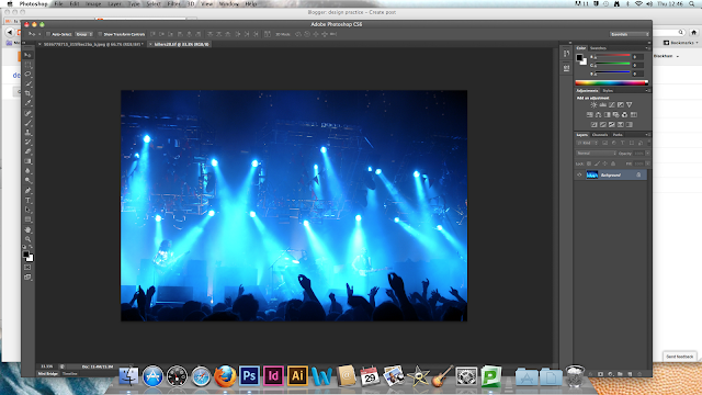
The majority of the colours in this image cannot be reproduced into CMYK, because they are too bright and cannot be reproduced by a printer.
As soon as you try producing this in CMYK in a destructive transformation, the colours become really dull (the destructive transformation was created by going to image - mode - CMYK).
As you can see, these colours are now extremely dull. If you were to now change the colours back to RGB, it would stay exactly the same as you used a destructive transformation and harmed the original image. If you had saved and reopened the image, you cannot go back to the original. You could change it back by pressing undo if the image had not been saved, however.
When you're working on a brief, you need to remember that you are working for someone else and that they want something very specific. So you would need to produce a 'proof' (a mockup/test image) to showcase and present to the client.
Click view-proof colours. You should always check before you press proof colours that the proof setup is set to CMYK. This will show you the proof version of CMYK colouring, without destructing the original image.
Click View-Gamut Warning. If something is out of Gamut, it means that it is out of the specific colour range that you are using (these are highlighted in grey).
How can we produce these colours in Gamut in a non-destructive way?
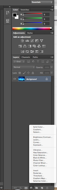
If we use an adjustment layer, we are not altering the original image. Click on Hue/Saturation. The image at the moment, is a really bright turquoisey blue which is out of the Gamut range of RGB and has also taken away a lot of the detail.
By adjusting the hue and saturation of the images, you can bring the entire image into the Gamut range. This will probably end up changing the colour of the light, but means that when you press Gamut Warning, all the colours are usable. You can also see a lot more detail now that the image is in red (and the original hasn't been deleted or altered).
DESTRUCTIVE TRANSFORMATION
By pressing cmd+l to bring up the levels bar
(once you've made this transformation, it is hard to then adjust the image after you've saved it)
NON DESTRUCTIVE TRANSFORMATION
(using the adjustment layers button, and clicking on levels)
The graph shows the spread of colours. The whites are on the right, the blacks are on the left, and the midtones are in the middle.
The mosaics and plants are now much more vibrant, however the windows are brighter as the colour has been bleached. Another advantage of using adjustment layers, is that you have a mask attachment to the adjustment (the white rectangle in the layer bar by the padlock). You can click on the mask to mask off all the windows so that they aren't adjusted. To mask an area off, you need to make sure that the foreground colour is 100% black. You can now paint around the areas of the image that you don't want the layer adjustments to be applied to, but remember to use a 0% hard brush as this will make sure that the edges of the areas you're painting over are soft and not distinguishable.
As you can see, the windows are now easier to see and crisper.
A very common dilemma you have when photographing with the sky in the background, gives definition and texture to the sky and clouds but leaves the foreground image very dark and not very detailed. When taking the photographs, it is usually better to take photos that emphasize the sky in detail and the object in silhouette, as you can bring the detail into the foreground object, whereas if the photo was detailed in the foreground and not in the sky, you can't bring that detail back in the sky as it is too light.
Using the Quick Selection Tool, you can select the silhouette of the statue in the image.. Click and drag over the silhouette to select it, then press Adjustment Layers-Levels and alter the image.
However, the gaps in the statue (between the arms and the wings etc) are now bleached out and not like the clouds in the background, as they were part of the previous selection. If you use the Magic Wand Tool and click anywhere inside those areas (add to the selection by holding the shift key if you have more than one bleached area). Then go to Edit-Fill-Use-Black-OK and deselect.
Now those areas have gone back to the original sky behind them.
You can create multiple selection layers in one document so you can change the clouds in the background, or even add illuminous shapes to look like the sun..
You can use Photoshop to seamlessly make a Panoramic photograph using many photos of the same areas.
File-Automate-Photo Merge
Best to leave on auto, but can experiment if you want a different effect. Open all the photos that you want to use in your panoramic blend. make sure that 'Blend Images Together' is always checked. You should also make sure that the photos haven't got a Vignette (dark edge) effect on them, as this will mess with your final image. Generally leave the settings to the default settings.
The image will then need cropping so that it is straight rather than jaggerdy by using the Crop Tool.
TA-DA!!!
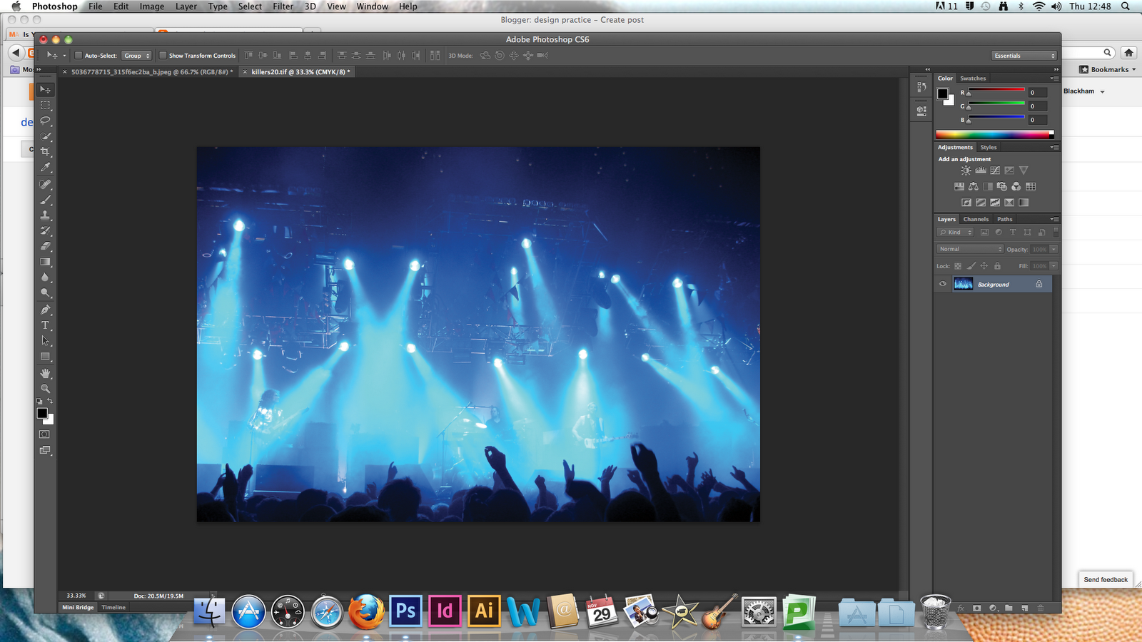


 If we use an adjustment layer, we are not altering the original image. Click on Hue/Saturation. The image at the moment, is a really bright turquoisey blue which is out of the Gamut range of RGB and has also taken away a lot of the detail.


