Photoshop's soul purpose is for 'shopping' (manipulating) photographs, hence the name Photoshop.
Before creating anything on Photoshop, you need to know the output of the image (what the image is going to be used for).
Photoshop does not work with Vector Graphics. Photoshop works with Bitmap Graphics (pixels). This means that you need to consider the output of the design so that you can produce it at the correct size, otherwise it will become pixelated due to scaling. You should never increase the size of the original Bitmap image.
The resolution is the quality of the image. The higher the quality of an image, the more pixels you have inside an inch. It's determined that the average human eye cannot distinguish one of these pixels if it is 1/300 of an inch (so always do print-based work in 300ppi). Huge images (like billboards) are usually printed at a much higher resolution to keep it crisp and often printed in dpi (dots per inch).
If you're designing for something that is screen-based, you design it at 72ppi.
Whilst designing on Photoshop, you will always work initially in RGB as the screen displays in RGB colour mode, you can then convert this to CMYK for printing. The colours created in RGB cannot be reproduced in CMYK. Never change the colour mode on the page settings, leave it on RGB.
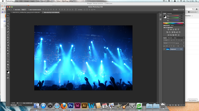
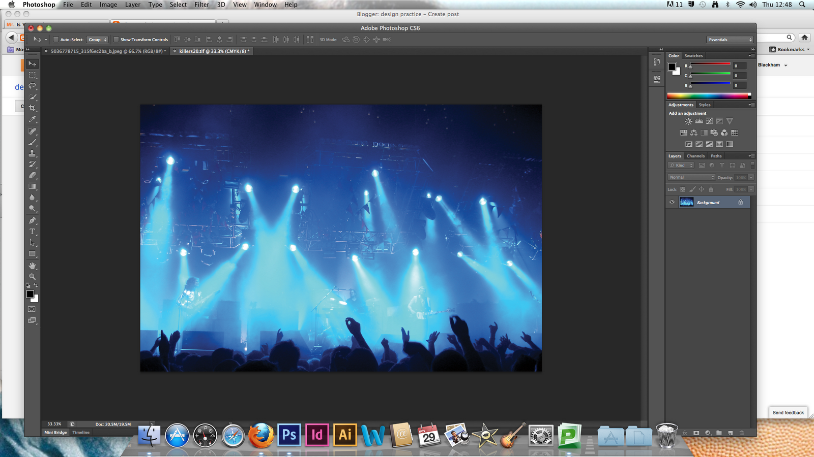


 If we use an adjustment layer, we are not altering the original image. Click on Hue/Saturation. The image at the moment, is a really bright turquoisey blue which is out of the Gamut range of RGB and has also taken away a lot of the detail.
DESTRUCTIVE TRANSFORMATION
By pressing cmd+l to bring up the levels bar
(once you've made this transformation, it is hard to then adjust the image after you've saved it)

NON DESTRUCTIVE TRANSFORMATION
(using the adjustment layers button, and clicking on levels)


A very common dilemma you have when photographing with the sky in the background, gives definition and texture to the sky and clouds but leaves the foreground image very dark and not very detailed. When taking the photographs, it is usually better to take photos that emphasize the sky in detail and the object in silhouette, as you can bring the detail into the foreground object, whereas if the photo was detailed in the foreground and not in the sky, you can't bring that detail back in the sky as it is too light.

Using the Quick Selection Tool, you can select the silhouette of the statue in the image.. Click and drag over the silhouette to select it, then press Adjustment Layers-Levels and alter the image.


You can create multiple selection layers in one document so you can change the clouds in the background, or even add illuminous shapes to look like the sun..


You can use Photoshop to seamlessly make a Panoramic photograph using many photos of the same areas.
File-Automate-Photo Merge


1. What skills have you developed through this module and how effectively do you think you have applied them?
I think that my skills on illustrator have definitely developed through the workshops we had, and the process of constructing my typeface has helped me learn how to use the pen tool to it's full potential. I also think that my research and development skills have improved throughout the term and I'm finally coming to grips with how to use my blog effectively.
2. What approaches to/methods of design production have you developed and how have they informed your design development process?
I think I've developed my use of fine-liners and inks during my design process, and the use of these black inks and pens has definitely helped me produce my final typefaces as the limit of colour meant that I paid a lot more attention to detail and the general idea I was trying to portray. I think I have approached my designs differently to how I usually would by limiting my resources, which has helped me to come up with strong concepts.
3. What strengths can you identify in your work and how have/will you capitalise on these?
I have identified that I have a strong eye for detail and have also noticed that I can draw out typefaces pretty accurately and sometimes spot on. I applied these strengths to my typeface designs, concentrating on every little detail of each letter so that the typefaces are consisted and almost perfect. I think my attention to detail also helped to create my poster designs to their full potential and I'm extremely proud of the work I've been producing.
4. What weaknesses can you identify in your work and how will you address these in the future?
In all honesty I have noticed my main weakness is keeping on top of my blogging and have became better at this as time has gone on. I think this will eventually become second nature and I won't get so stressed and worried about it as I'll know that I'm doing it correctly and thoroughly as my skills start to pick up.
5. Identify five things that you will do differently next time and what do you expect to gain from doing these?
- Blog every night so that I am constantly up to date. This will ensure that I am more relaxed about what I still need to do and will also help to improve my blogging skills gradually.
- Spend extra time coming up with ideas so that my development sheets are more impressive and at a larger quantity. This will also develop my skills in coming up with good ideas.
- I think next time I'd like to experiment with various types of stock for printing on, as this choice of stock often improves designs immediately, because they add texture and a new colour which you hadn't previously thought of.
- Experiment with crafts and paints when creating final pieces rather than ordinary use of pens, pencils and computers. This will show more development and ideas for assessment, and I could also end up with stronger ideas than before.
- Research into ideas in more depth as this can often strengthen ideas that I have already come up with, but can also help to come up with completely different ideas than before (also visit the library more often for research).

OCR A Font Family


Rockwell


Fute PL


Monotype Corsiva


Colonna


Most Legible Fonts From Each Font Family

We were asked to create something to send out in the post that related to the 3 posters on our chosen article. The mail-shots had to fit into a DL envelope which you could also create yourself so that it related to your previous ideas and concepts. Once again your designs were limited to the 2 colours and stock that you chose before and had to be in the same style so that they depicted your other designs.
INITIAL THOUGHTS AND IDEAS
So that my mail-shots and envelope fitted in with my other ideas, I wanted to keep them as simple and to the point as I possibly could. I didn't want a lot of information crammed into a small amount of space, and I wanted the designs to look really similar to the poster designs in layout and format.
I decided that I was going to create something not to inform the reader about what the Female Engagement Team do in Afghanistan, but to encourage them that joining would benefit them and would be a good idea. I decided to do this through questioning the audience rather than just supplying a lot of facts and information they probably wouldn't even read or take in.


I think that just sending out information about what women did in the war and what the Female Engagement Team was would be a bit too plain and wouldn't really be that engaging for a lot of women, so instead I thought I would produce some sort of flyers to encourage more women to take part in the war in some way.

The use of circles is quite common throughout my poster designs and I thought that creating a leaflet to go inside the DL envelope that incorporates the shape of a circle somehow, whether the leaflet is actually the shape of a circle itself or has a lot of circles in the design, would keep the consistency and would relate to the simplicity and use of circles in my poster designs.

Once again I went along the idea of using circles, but thought that the pages would need to join up in the leaflet, therefore the circle won't be a full one as one side will need to be straight to make the booklet work. The information and image in the booklet would need to be minimalistic to relate to the poster designs previously created.

The concertina concept could work quite effectively as you can get a lot of information onto a small amount of space that folds up to make it more like a leaflet to read. The concertina could have lots of different type along it, or could fold out to make an image that represents the Female Engagement Team.

Obviously if I were to create a leaflet, flyer or booklet that encourages the reader to join the army, they will need something to either fill in and return or a website to follow onto so that they can apply that way. I think creating a form to fill in could work well, however it means the reader has to then post it back to the company, where as applying online is more convenient for the masses. Plus applying online means that the reader can then find out more information about what they're applying for and means that they can decide for themselves without feeling pressured to send the form back.


I spent quite a bit of time thinking about typeface styles that would work well with the several concepts that I had come up with so far. My favourite choices were either stencil styled typefaces or gothic ones. I really liked the sans serif, slightly curvy fonts, because of the simplicity and fragility of each letter. The only problem is that they're that simple they won't "scream" war or females when you first read the words. They also don't grab your attention quite as easily as said stencil typefaces.

Going back to the ideas that I came up with for my poster designs, I think that creating the word RECRUIT in the same way that I created the word WAR in my type & image poster would form a sense of cohesion and will make my mail-shots relate well to my poster designs effectively.

Following the idea of using the word RECRUIT made up of flowers, the back of this flyer could be simply an application form for the army, or maybe just a few rhetorical questions to get the reader considering about how they can make an impact on another woman's life. I really like the idea of using language to form a feeling of guilt in the reader's mind as they ponder over the sentences. I think this would be the most successful use of dialect in my design.
FINAL IDEAS
DL Envelope Design


I really like my final envelope design as it is really minimalist and straight away relates to women by using the symbol of venus (♀), which you automatically depict as as sign of women or femininity. I stuck to the previous design themes by the use of colour, lines and flowers. I think the flower pattern that was used in the WAR poster works really well lining the inside of the envelope. The simple use of flowers gives the envelope an immediately delicate and feminine touch and works really well with the stock and colours used. I chose to put the flowers in the circle of the symbol of venus as I thought the colours would compliment the golden colour of the first class stamp, which works extremely well! I really love my envelope design, as I find it extremely aesthetically pleasing and is definitely made to my personal taste, and I think a lot of females could easily feel the same way about it.
Designs For Flyers Inside The Envelope


I decided that even though my flyers would need quite a bit of information on them about what the women could take part in, I thought that if I just asked the reader a few questions and then told them what to do next, then they actually had the choice whether to look further into the cause or not, rather than just bombarding them with information that they may not even be interested in.
My initial intentions were to create a double sided leaflet to put inside the envelope, however it didn't go according to plan and a lot of money was spent on printing my designs trying to get them in line on a double sided page, failing every time. So I decided to just go with two separate flyers, which I think works just as well and may even make the audience feel as though they got more in the letter than they actually did.

I decided to send my mail-shots to various schools, colleges and places where girls are likely to be and have the opportunities to gain experience of what joining the army could be like (for instance they could join CCF at school and gain useful experience in army training which could encourage them to join the army). The reasoning behind choosing to send one of my mail-shots to Girlguiding UK was the fact that at guides you learn all sorts of skills in various areas of life, and are constantly encouraged to help others, therefore working for the Female Engagement Team would be a perfect career choice for someone who wants to get involved and help other women as much as they possibly can.
I think that my mail-shots, DL envelopes and mailing list work really well together and compliment the posters perfectly. I am really happy with my final results and actually really proud of my work for this project seeing as we had a short amount of time to achieve something worthwhile. I think that if I were to redo my designs in any way, I'd probably choose an alternative font to the one I used for my body copy and text throughout my designs, as it was a downloaded font on my macbook so wasn't recognised on other macs which was annoying. Also I think the font itself is almost wobbly in a way, and sometimes looks as though it doesn't sit on a straight line. I'd also possibly consider sending my mail-shots to some other organisations where there are plenty of women, maybe of an older age range than schools and colleges.
- Leave your comment • Category: mail-shots, messageanddelivery, OUGD403
- Share on Twitter, Facebook, Delicious, Digg, Reddit