First of all we pitched our ideas to 2 other groups so that everyone knew exactly what we were doing. Once each group had pitched, we were given someone else's brief to work on and answer questions to...


Our feedback was as follows:
Comment on the effectiveness of the concept. Does it address the problems identified in the brief?
Strengths & Weaknesses
Taken the idea to a 3D stage, colours work very well. It's creative and detailed. Hand craft element could take a long time!
Suggestions
Use the pins as a support for the thread and shape the letter out of thread by using the pins as hooks. For the "drops of youth" you could fill an pipette with different colours.
Comment on the design direction and decisions made regarding the production and distribution of the response.
Design direction fits the brief, taking it to 3D. It's creative and interesting and gives people something to look at and admire. The only problem is creating 4 A2 posters like this could take a long time!
Suggestions
Experiment with more physical materials, i.e.: bruscho granules, for the great idea about 3D type on your posters.
Comment on what you would do differently and why?
For the campaign you could potentially do something about:
- fight for democracy (as it is a major social change)
- promote freedom of speech
Look at design suggestions on A4 sheets
Social media competition
- #colourcrush #bodybutter
- your chance to win a sample of each 4 things you're promoting by hash tagging a good deed for the day
If money and time were no object, how far would you take the brief based on what has been presented?
LCD screens that can change colours on the screen
Big 3D letters made of a good material, i.e. coloured ceramic for the swirls that you have made
Plane in the sky to write "crazy sexy crush" with the colours you have already
Have the "colour palette" get dropped from a helicopter so that it falls down from the sky
What contextual references can you suggest that will be relevant to the proposal?
Typography books
"typography in the real world" - search this in google and try and find type that was impactful and memorable


Action Plan
- background experiments - Friday 28th Feb
- final poster layouts
- final quilling
- ask photography about smoke
- campaign design variations
- external channel ideas
- Leave your comment • Category: collaborative brief, OUGD503, responsive, studio brief 2
- Share on Twitter, Facebook, Delicious, Digg, Reddit
James and I decided to work at uni to produce some test pieces with some strips of paper, so that we knew exactly what works well, what is hard, what looks good, etc..

Using pins helps with keeping the letters in place, but it works better once you've started to stick the letters down, rather than using the pins as an outline to work with..


I played around with making different shapes using quilling techniques, and tried filling in the inside of the design with paper strips..


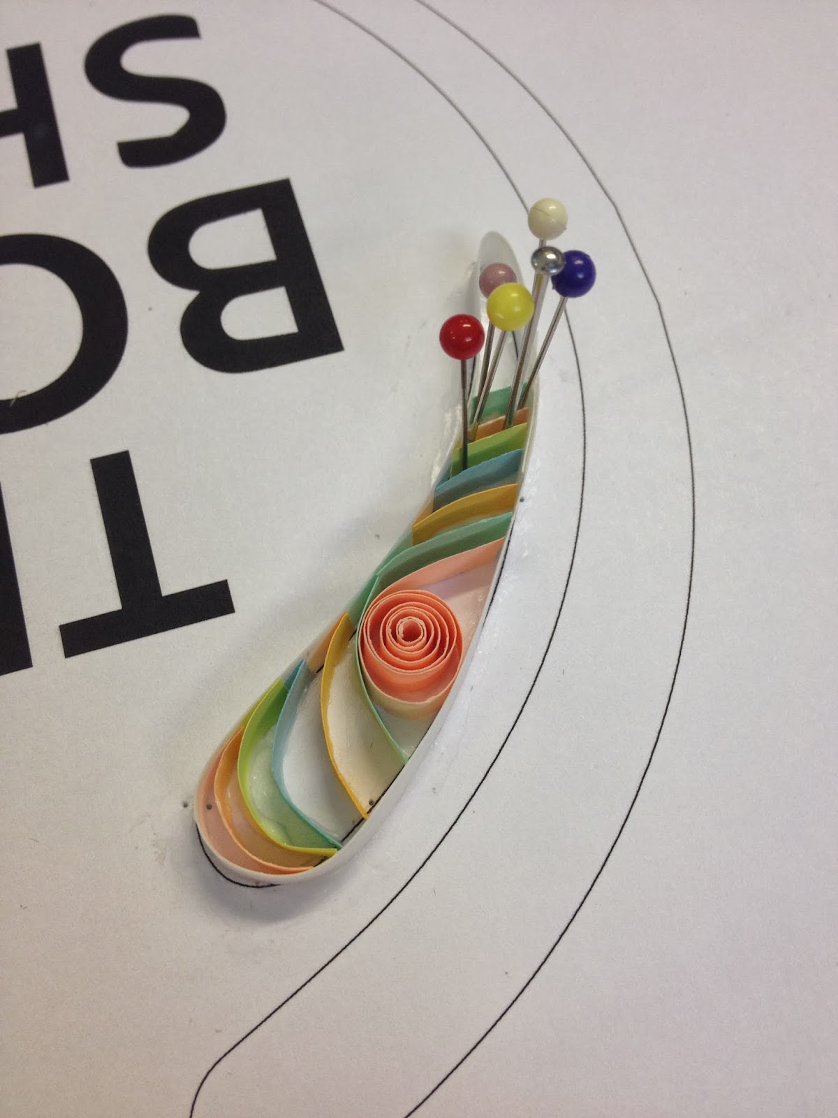


Using pins helped to construct curves and keep the paper in place whilst the glue sets..


I quite liked the effect from filling the insides of the shape in with paper, however it can look a bit messy and was really hard to get perfect!


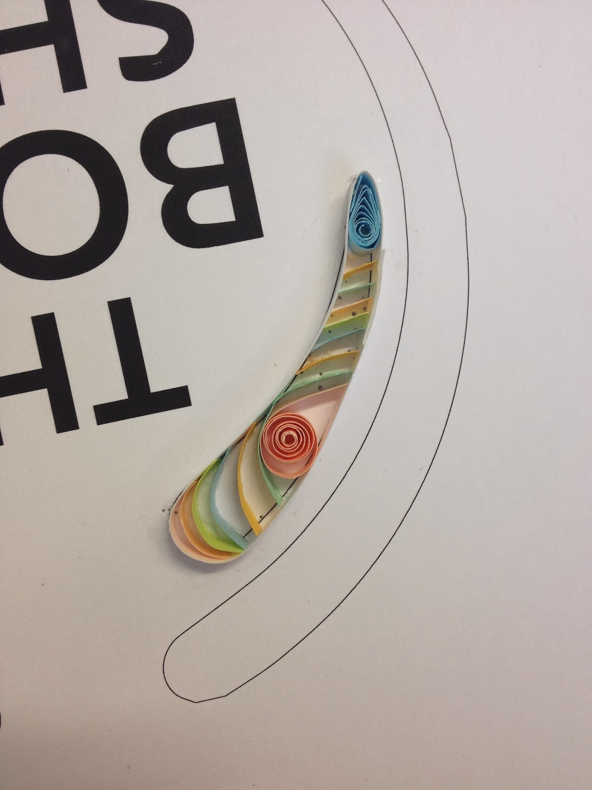
Meanwhile, James was working out how to create the letterforms out of paper effectively. He tried it out with a few different stocks to see what worked best..


The white stock was our favourite..

I also had a go at making letterforms out of paper, so that we both knew how to work with it. I then started to fill the background area in with swirls of paper..


James started to fill the inside in with strips of paper, then experimented with filling the background in with paper, but it was hard to read with the background in strips..


The more colours, the easier it was to distinguish the design of the poster..


- Leave your comment • Category: collaborative brief, OUGD503, responsive, studio brief 2
- Share on Twitter, Facebook, Delicious, Digg, Reddit
First of all we presented our work so far to the groups, and then individually we wrote feedback for one another on what we had produced.


This is the feedback that I received:
Strengths
- Aesthetics of publication and relation to content
- Content and structure
- Consistent usual features, such as colour scheme, typeface, illustrations
- Formed a strong outcome
Areas For Improvement
- Try justifying the text alignment in the body copy
- Consider justification of body copy, to make it easier to read / legible
- Make sure quotes are spelt with English grammar, e.g. colour rather than color
Considerations
- Have a look at Russian poetry
- Consider final production of the book
- Consider packaging further
- What stock are you going to use for the case? - needs to be sturdy!
- Print onto the sleeve or some more information on the packaging on what the publication is
- Consider tea-dying the stock before printing to make the pages look old
- Layout needs to be structured to fit with style - think about experimenting with it.
- Play around with ideas for the front cover
- Think you could be more adventurous with the case
- Maybe make the layout (margins) the same for the body copy pages, as well as the title pages
Changes To Make To The Design


Action Plan
- Make alterations that have been highlighted within the printed copy of the book so that the layout and everything is consistent and concise
- Experiment with different stock and 'tea-dying' the paper
- Try and make the packaging more exciting in a way that suits the Russian aesthetic
- Play around with the layout a bit - try justifying the text differently
- Think about binding methods
- BLOG BLOG BLOG BLOG BLOG
- Leave your comment • Category: brief 1 (505), OUGD505
- Share on Twitter, Facebook, Delicious, Digg, Reddit
For the second task, we were asked to create a brochure for the exhibition.
We were given certain content and images to use within the brochure.
Limitations:
- The logos must remain black and white
- Images cannot be altered, but can be cropped and resized
- Additional colour can be used within the text
- Layout must be A5 concertina style
This is what I produced:


PDF on issuu:
Screenshots close up:


How it would work as a concertina brochure:


- Leave your comment • Category: brief 1 (505), OUGD505
- Share on Twitter, Facebook, Delicious, Digg, Reddit