Product and Publication
I decided to use my research to create a publication, because I thought that all the research I collected could easily relate to book, magazine or publication designs. I went through some other ideas for the other two areas of design we could go down, however I wasn't as happy with these ideas as I was the publication ones.


My Final Idea:
Whenever I asked someone about their favourite part of IKEA or what they remember most from going to IKEA, I frequently got the response "swedish meatballs". When I went to IKEA myself, I tried some swedish meatballs with Sarah and Joe, and thought that they tasted wonderful.

So I decided to make something that relates to this. I thought at first that I could redesign the IKEA restaurant and food menus, however I didn't really like this idea, so instead I decided that I will produce a recipe book filled with Swedish recipes that you can make at home.
At first I thought that this book could potentially become quite a large book, as there are many Swedish recipes that I could choose from. The idea of making a book consisting of over 50 pages daunted me, seeing as we only had 2 weeks for production. So I decided to narrow my book down to 10 iconic Swedish dishes.
Sweden is known for their meatballs and love for anything sugary or cakes, so I thought I'd research a bit more into iconic Swedish dishes, as I didn't really have any to go from, and came up with the following:
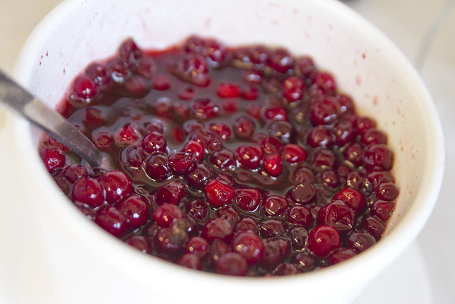
Lingonberry Sauce
The Swedish sauce can be served with meat, or over Swedish pancakes. You can also create Lingonberry Juice to drink from the sauce or from the Lingonberries themselves. Because Lingonberries are plentiful in the forested areas of the inland, the jams and sauces are easy to prepare, and it preserves well.
Knäckebröd (Crisp Bread)
Crisp bread is a flat and dry type of bread or cracker, containing mostly rye flour. It is popular in armies and schools, because of its light-weight and simple, transport friendly shape. It is a very cheap type of bread, and when stored in the right dry conditions it will keep fresh and edible for a very long time. The bread was considered a poor man's diet for a very long time, however in recent years Nordic countries have renewed their interest in Crisp Bread.

Swedish Meatballs
The meatballs are made with ground beef or a mix of ground beef, pork and sometimes veal, sometimes including breadcrumbs soaked in milk, finely chopped fried onions, some broth and often including cream. They are season with white pepper, allspice or salt. Swedish meatballs are traditionally served with gravy, boiled potatoes, lingonberry jam, and sometimes fresh pickled cucumber. Traditionally, they are small, measuring one inch in diameter.

Most cured herring uses a two-step curing process. Initially, herring is cured with salt to extract water. The second stage involves removing the salt and adding flavorings, typically a vinegar, salt, sugar solution to which ingredients like peppercorn, bay leaves and raw onions are added. In recent years other flavors have also been added, due to foreign influences. However, the tradition is strong in Denmark, Sweden, Finland, Norway, The Netherland, Iceland and Germany. Onion, sherry, mustard and dill are some of the traditional flavourings.

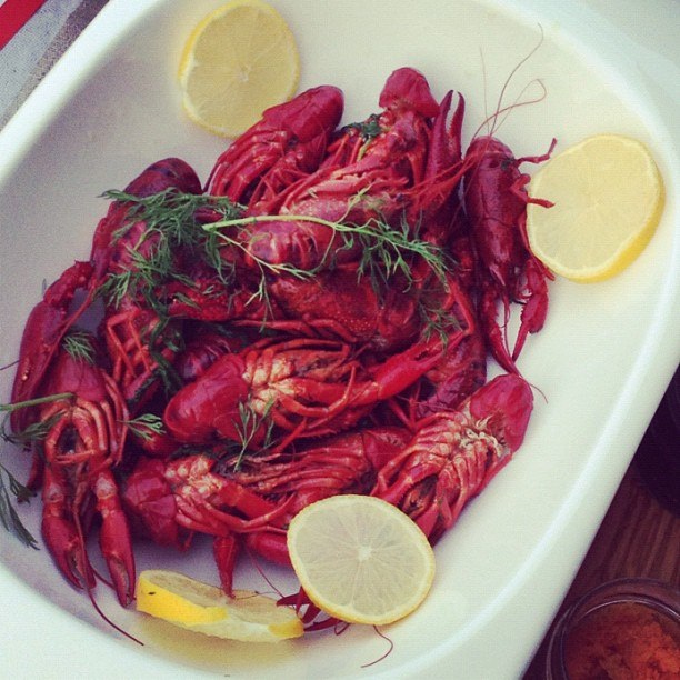
Crayfish Party Dishes
A crayfish party is a traditional summertime eating and drinking celebration in the Nordic countries, originating in Sweden (called a kräftskiva). Crayfish parties are generally held in August due to the tradition being started during Crayfish harvest season. Dining is traditionally outdoors, but in practice the party is often driven indoors by bad weather or agressive mosquitoes. Customary party accessories are comical paper hats, paper tablecloths, paper lanterns and bibs.

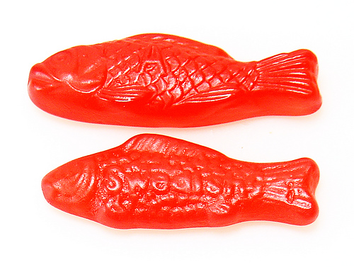
'Swedish Fish' - soft and chewy candy
Swedish Fish is a type of chewy fish-shaped candy. It has been developed with special flavors by the Swedish candy producer Malaco, which exports products to North America. In Sweden, the Swedish Fish candy is marketed under the name "pastellfiskar", literally meaning "pastel fish".
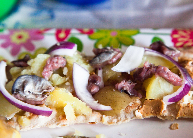
Open Sandwhiches
An open sandwich, also knowsn as an open face/faced sandwich, Ulrich Sandwich, bread baser or tartine, consists of a single slice of bread with one or more food items on top.

Pea Soup & Pancakes
In Sweden and Finland it is traditional to eat pea soup on Thursdays, served with pork and mustard, and pancakes for dessert. In Finland the soup is made of green peas, in Sweden they use yellow peas.

Semla
Buns filled with cream and almond pastes are known as Semla (Semlor plural) and are eaten on Shrove Tuesday, or 'Fat Tuesday' (Fettisdagen) as the Swedes call it.

Surströmming (foul smelling fish)
Surströmming (soured Baltic herring) is a Northern Swedish dish consisting of fermented Baltic herring. When opened, the contents release a strong and sometimes overwhelming odour; the dish is often eaten outdoors. Surströmming is often eaten with a kind of bread known as 'tunnbröd' (thin bread).
Prinsesstarta
Prinsesstårta (or princess cake) is a traditional Swedish cake consisting of alternating layers of airy sponge cake, whipped cream and thick pastry cream, all coated in a 2-3mm layer of marzipan. The marzipan overlay is normally green, sprinkled with powdered sugar, and often decorated with a pink marzipan rose.

Falukorv
Falukorv is a large traditional Swedish sausage made of a grated mixture of pork and beef or veal with potato starch flour and mild spices.

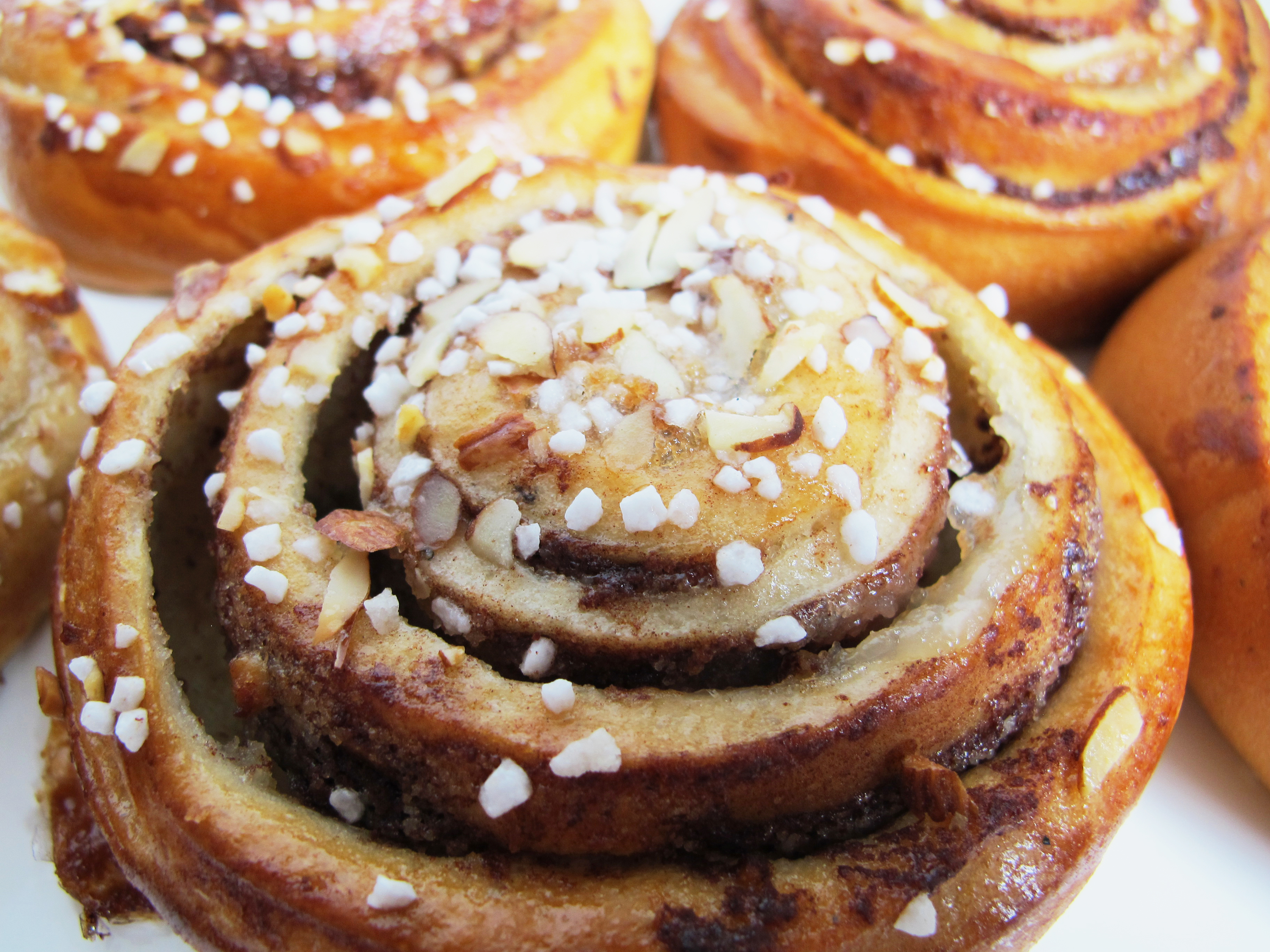
Kanelbullar (cinnamon buns) are a classic at Swedish coffee parties. If you are invited to someone's home for coffee, you always get a cinnamon bun, a cookie or a piece of cake with it.
Research Into Recipe Books


Outcomes After Research.
After researching into different recipe book designs, it became pretty clear that the most successful looking recipe books contained an image of what your food could look like when you've finished cooking.
Another recurring theme was colour coordinating pages of the books which reminded me of the way they use colours to catalogue the different sections of house products for inside the IKEA catalogue. I decided that the use of 3 colours (one for starter recipes, one for mains and one for desserts) would be the best way of organising my recipe book so that it is easy to navigate around.
All the recipe books that I looked at were very simple and well structured, this meant that the reader could easily follow the instructions without confusion and it also meant that the pages weren't overly cluttered and abusive to the eyes.
One problem that occurred was the fact that I couldn't use actual photographs of the finished recipes, as that would mean buying all of the ingredients needed for every recipe and creating them all myself to then photograph. I didn't want to use stock photos produced by someone else, as this would rip off someone else's work, so I decided to draw each dish out instead on illustrator in a minimalistic style similar to the characters used in the IKEA instructions booklets.
I also thought that most recipe books only used one or two colours in the text on each page. I decided to stick to the colour black for body copy, and then recipe titles etc will be the same colour that has been set for each group of dishes, for example knockerbrod would be written in green, because the starters colour is green.
Because of my recipe book being extremely minimal and simple, I will need to use interesting stock to give the pages some texture. I will also need to consider the binding, as I don't want to use something overly complicated, because it will mean that the book isn't completely consistent in design and style.
Designing The Recipe Book
Working on InDesign with pages of a book, means that I will need to make sure I know what is going onto what page so that I can set up my document correctly. I made a small mock up of the end product, so that the document is correct for when I start my design.
I found it really difficult to figure out the page layouts for my book and it was pretty confusing trying to get the document set up so that the final book would print correctly, however eventually I achieved it.


Thinking about design ideas, I thought that I could recreate some icon IKEA characters to go on some of the pages, which will make the recipe book more engaging and fun. This could also help to get children involved in cooking Swedish dishes.


When I was designing the front cover of the recipe book, I found it difficult trying to come up with something that related to the IKEA catalogue front cover, but was also relevant to my recipe book. I tried using a photograph of some Swedish Meatballs I tried when I visited IKEA, but it was hard to incorporate this photo with the overall design theme and minimalistic feel to the book.
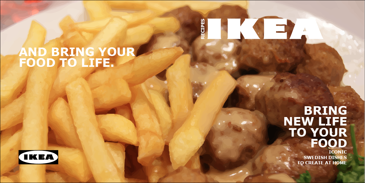
In a way, I quite liked this design idea, as it was well related to food and recipes, and looked really like the original design for the IKEA catalogue cover, however the photo of the meatballs felt too overpowering to me, and didn't really suit the layout ideas I had planned for the rest of my book. After several attempts at trying to make the photographs I took work, I decided to scrap the idea of using a photo, and make the front cover as basic as possible.
I really liked the idea of having an image that was continuous over the front and back cover of the book, so I decided to create something simple and well suited that could work in a similar way.
I decided to play about with the iconic IKEA characters on illustrator, giving them chef hats like my original illustrations, and came up with the following...
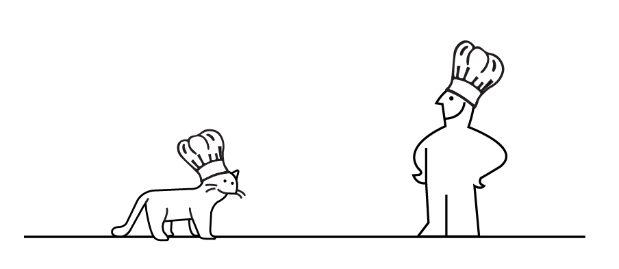
I then applied this illustration to the layout for my cover in InDesign and was really happy with the outcome...

When it comes to printing the final cover image, I've decided to use either a grey or brown colour stock to give the cover page texture. It will also mean that the design of the cover isn't plain white and boring.
For the contents page, I decided to recreate one of the contents pages in the IKEA catalogue, and pretty much copied the body copy with slight subtle alterations to make the page relevant to a recipe book rather than a catalogue.

I liked the idea of using different colours to categorise the pages of the book, and used it in my design.

I chose to use 3 colours for categorisation in my recipe book. Originally I was going to use the 3 primary colours: red, yellow and blue. However, using the colour yellow would be difficult as it won't be visible when printed onto off white paper (my chosen stock). So I thought I'd use blue, green and orange, all at a similar saturation value.
I also created another character holding a spoon to place on the contents page, as I felt like it needed something to fill the space and make it more engaging.
For each recipe, I decided to keep the pages extremely simple and to the point. I didn't want too much colour in the illustrations of the food as this wouldn't suit the minimalistic feel, so i made sure that each drawing I produced was simple black and white line art. I also decided to try and stick to a 3 column structure on my pages, so that the text was laid out neatly and consistently. I translated each page into Swedish so that the recipe book was quite unique and different to most recipe books you can buy.
I thought that the Swedish text should be written on the left hand side of each double page spread, as it will emphasise the fact that the food is from Sweden, and seeing as the food is Swedish, their language should be the priority in the recipe book, as we should feel lucky to be able to consume their traditional food.

Each page of the book was laid out in this format, with the name of the recipe at the top in the corresponding colour to either starters, mains or desserts. The font I decided to use throughout the book was Verdana, as IKEA have recently decided to change the font that they use to this, which caused a major Graphic Design debate. However, I found the font really easy to work with and I think that it helped add to the overall look, making it extremely minimal whilst following modernist rules. I also found that the illustrations I created worked really well when placed next to the body-copy and recipe titles.
On each page I decided to place a line with a 6pt stroke towards the right in either blue, orange or green. I thought this would help the reader to find what they were looking for, as everything is colour coordinated!
Once I'd completed each page, I printed the pages off double sided, cut them out and then had to think about binding..

At first all my double spread pages were still connected in the middle, as I originally wanted to staple the book down the centre, as I thought this would suit the modern theme of IKEA. However, when the book was closed shut, the pages were visible behind one another on the right hand side as the stock is so thick, and I hadn't considered creating a spining system.
To solve this problem, I decided to cut my pages in half down the centre, so that I had lots of 200x200 pages. I then measured where I would put holes on every page, ready for sewing. I decided to use 3 holes, as I didn't want to over-complicate the design.

What I found most annoying about binding with needle and thread, was the thread was that thin, I had to double it up as the first time round the thread broke when I opened the book. It was also difficult making sure that the book was bound loose enough so that it opened and closed with ease. However, the middle bound of my book has somehow become tighter after several page turns, so every time I close the book, I need to loosen it with a pencil. I'm hoping this will sort itself out in time, but if I were to bound the book again, I think I'd prefer to use slightly thicker thread, with a larger needle so that the thread didn't cut slightly into each page and jam itself in there.
Final Printed Book


I think that if I were to create this book again, I would find more recipes to work with so that the book is denser, however if the books were given out for free in IKEA, it may not be worth producing a book consisting of lots of recipes as this would probably cost more money than it is worth as they wouldn't be selling the books. Therefore, if I were to add more pages, I would probably create a barcode and a price tag for on the back page so that this concept theme works and is worth IKEA producing (if they were to produce the recipe book). I would also print with a different printer, so that the book doesn't have the small mistakes (like the extra lines on the vector artwork, and a random blue streak down the centre of each page that was coming off of the printer rollers). I would also probably reconsider the front page, as something about it really irritates me, but I can't quite pick up on what it is.
Other than all of that, I am extremely pleased with the final design of the recipe book, and I think it turned out better than I had planned.
The Final Crit
On Friday 25th January, we had our final crit in Studio 4. We were split up into 3 groups, and took our final pieces up to the studio and left them out for the tutors to view. After about half an hour, we went back to receive some one to one feedback. The crit was a listening exercise, so we received feedback but couldn't try and convince the tutors otherwise by "bigging" our work up.
My feedback for my final product was as follows:
- totally fulfils the brief
- it was almost perfect, 100% suited IKEA and the info-graphics theme
- can tell that you researched into the theme in depth
- nice choice of stock
- well executed and crafted
- if sold in IKEA it wouldn't stand out as different, looks just like an IKEA product
- only problem would be the binding as it isn't really very plain and simple, or how IKEA may have done it. Staples would have worked better, or think of a simpler way of doing the binding?
Outcome After Feedback:
I am extremely pleased with my positive feedback. I spent a lot of time trying to make the product look like it was designed by IKEA, and was happy to find that Amber and Simon thought that it suited the research theme perfectly. I agree on the binding problem, as I had lots of issues trying to get the binding to work properly with my original stapling plan. I think if I were to rebind the book, I'd probably go to a printing company and ask what the simplest bound they could do was, and then maybe get them to do it for me so that the book worked well and the binding was achieved.