I chose to work with Joe Leadbeater for this brief, as we haven't worked together on a brief before, apart from making a cake for Typogateaux.
We initially reacted to the brief with issues we have found throughout the year.
New Experiences:
- living on your own away from home
- cooking for yourself
- cleaning the kitchen
- cleaning the bathroom
- washing up
- buying budget food
- buying suitable food
- doing the laundry
- meeting so many new people in one go, rather than gradually
- having the least experience out of the three year groups on the course
- being away from friends/other half
- meeting people from other places
- learning accents and slang
- learning geography
- being in a new city/new surroundings
Difficulties:
- social interaction
- fresher's flu
- committing to studying
- feeling pressured to go out
- finding uni
- getting around uni
- getting around Leeds
- finding cheap places to eat around Leeds
- visiting home if you live far away; booking tickets, organising time, etc
- maintaining relationships and friendships
- keeping your room tidy
- finding a house for second year
- living without a TV
- transportation/travelling
- printing costs
- general costs for materials
- getting to/booking inductions for workshops
- booking print slots
- plucking up the courage to talk to your tutors
Finding A House For 2nd Year
Joe and I chose this problem to work with, as we have both found it to be the most difficult issue that we have come across during the year, and by far the most stressful responsibility to deal with.
Problems that we faced:
- finding a reliable and trustworthy Estate Agency to look at houses with
- finding appropriate people to live with
- when to start looking for houses
- looking for houses that are good value for money; knowing what your money is going towards
- the number of people that you choose to live with
- location of the house and how it relates to uni; Hyde Park, Burley, Headingley?
- finding a housemate to fulfil a place
- paying a deposit; asking for a receipt
- signing and understanding a contract; asking for copies of everything that you've signed
- security and safety; is the area safe? is the house secure? are you likely to be robbed?
- what do you really need? facilities, etc
Research:
Primary:
Ask people in our class/friends who study at different universities:
- who they went through when finding properties
- how they found it
- if they had any problems
- how much of a variety their agencies had to offer
- how much they're spending a week next year
- any advice they have on housing
- did you feel comfortable with the estate agents that you spoke to; are they truthful or just trying to sell a house?
- would you rather live in a house or halls?
Ask Estate Agents:
- when students should start looking for housing
- how much they should expect to spend
- how many people you should live with
- the best places students can live that aren't overpriced
- areas to stay clear of
- how much they charge for administration fees/deposits on houses; how long you have before you have to pay the deposits, etc (leniency/time)
- how long their contracts are for, on average
- any websites that they would recommend to help with house/spare room hunting
- where they advertise their properties
- samples of their brochures (poor quality design and spelling, generally means poor agency)
- are they members of the NAEA (The National Association of Estate Agents)?
- whether they take you to the houses themselves, or you meet them there
Take photos of areas and housing to give guidelines on what to go for/what to look for; security, quality of area, quality of house, mould, dampness, etc
Secondary:
- use student forums to find out information; how people have struggled, where to look, general advice
- generally looking at Estate Agencies online and collecting the best on how they present themselves
- look in student housing newspapers to find agencies/housing
- look in student housing packs
- look at ways to promote our information; websites, newspapers, the agencies themselves, flyers, etc
Methods of Communication:
We listed methods to communicate our message to future students
- fun questionnaires to find out what type of house mate you are
- maps to do with location of housing
- infographics on budgeting
- a questionnaire on affordability of housing
- a video on house hunting (for example: kinetic typography)
- top trump style cards on house hunting
- beer mats/glasses
Questionnaire:


Results:
concept, production, method of delivery
✿✿✿✿✿✿✿✿✿✿✿✿✿✿✿✿✿✿✿✿✿✿✿✿✿✿✿✿✿✿✿✿
GROUP CRIT WITH SIMON AND THIRD YEARS - FEEDBACK
- production costs are too expensive: printing onto glasses will cost a lot of money, and think about the fact that you could possibly be producing them for the entire class, not just one or two students in the future.
- good idea as it suits the intended audience
- consider a way of bringing all the products together
- make sure that the design theme is consistent throughout
- choose suitable production methods
- consider a way of persuading the students to keep the products
After the first concept crit, Joe and I felt that we had to rethink the products, as the cost to produce a lot them was out of our price range and we could think of better solutions that would be cheaper to make.
We also decided that it would be more effective if the products were designed to look expensive, so that the students would want to keep the products rather than throwing them away - this could be achieved through the colour, stock and production choices.
✿✿✿✿✿✿✿✿✿✿✿✿✿✿✿✿✿✿✿✿✿✿✿✿✿✿✿✿✿✿✿✿
After the crit with Simon and the third years, Joe and I decided that it was time to venture out into Hyde Park and Headingley to gather some primary research. We had a look online first at places that we would like to visit, and then over the Easter holidays went and took some photos of these places, and even bought some art materials from Dinsdales!
✿✿✿✿✿✿✿✿✿✿✿✿✿✿✿✿✿✿✿✿✿✿✿✿✿✿✿✿✿✿✿✿
GROUP CRIT WITH AMBER AND SIMON - FEEDBACK
- consider the costs
- maybe put a map in the publication to help the students find their way
- consider the production time
- book yourself laser cut inductions and screen printing slots
After the crit, Joe and I felt that a lot of the ideas we had come up with were possibly out of our league for the time available, and maybe not even necessary! We decided to sit down and reconsider our final outcomes, so that we could create items that were high quality but don't cost a bomb to produce.
We decided that screen printing will be extremely time consuming and the final result may not even work as well for what we want to achieve, therefore we have decided to try using Gold Foiling instead, as this will be a lot more reflective and will also cut the production time down AND the production costs.
✿✿✿✿✿✿✿✿✿✿✿✿✿✿✿✿✿✿✿✿✿✿✿✿✿✿✿✿✿✿✿✿
DESIGN SHEETS
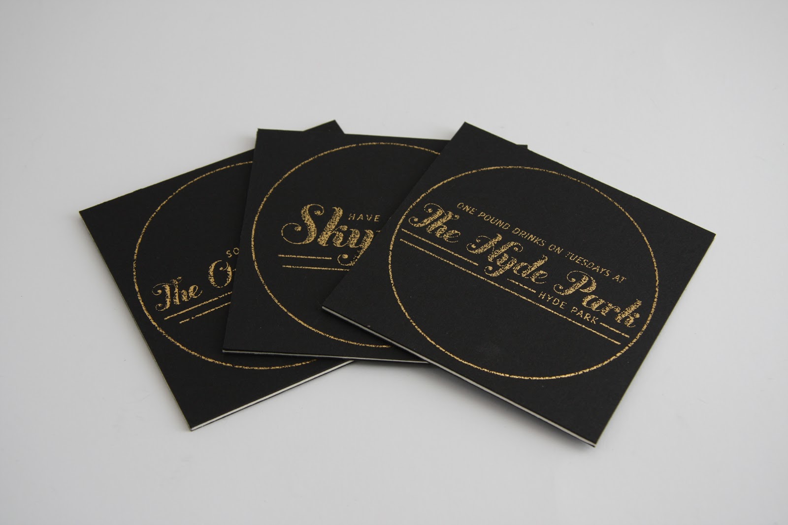
When it came to designing the drinks coasters, we wanted to produce circular coasters, as they will look elegant and will be interesting to design within. I played around with various typestyles that we could go with, to find something that looked elegant.
I really like this design that I came up with - I think that the Buttermilk font works really well amongst the circle and is also generally a pretty and elegant typeface. I also like the use of a little bit of gold, however we are planning to print onto black so everything may have to be gold!
It was really difficult to come up with some good concepts for the Travel Pass holder, as it's quite a boring object to design for. We wanted to create something that you would want to use/keep, because of how aesthetically appealing it would be, yet something that is also functional and easy to use and store bus passes in. In the end we decided that creating the origami bus pass holder (found on the top right hand side of this design sheet) would be most achievable and generally very aesthetically pleasing.
I liked designing the box that the popcorn would come in, as I find designing packaging quite engaging and that I had a lot I could do with it. I think that the decision to go for a bag shape box, similar to the bag that everything would come in, was a good idea as it held consistency with the rest of the designs and will also looked really cute when produced!
Because we were literally just going to put some text onto the sketchbook for Dinsdales, I decided to focus a bit more on how we could make that text look a bit more interesting by adding swirly furniture around it. This really wasn't my strong point, as you can see from the above design sheet, however I did produce one design I quite enjoyed.
I then thought that this typeface would come alive a bit more with a few lines of extra gold on the letters.
✿✿✿✿✿✿✿✿✿✿✿✿✿✿✿✿✿✿✿✿✿✿✿✿✿✿✿✿✿✿✿✿
Et voila! I really like this idea, however the swirls still need a lot of work! It should be easier to produce something on the computer.
Joe found out how to create ornate frames to surround our type for the Dinsdales sketchbook, so he had a little play around with a few designs for that.
Whilst I desperately tried to recreate the design I had produced on the design sheets. It was really difficult to make the swirls look right, and it took me ages to produce something I'm still not entirely happy with! However, I really liked this idea.
But then when Joe came up with this, we knew we had the final result! I really like the elegant feel that you get from the frame around the typeface, and the little infographic style illustration of a quill and ink works really well. I think that this will work really well on the front of a sketchbook, so gave up on my terrible swirls and gave in to Joe's design.
✿✿✿✿✿✿✿✿✿✿✿✿✿✿✿✿✿✿✿✿✿✿✿✿✿✿✿✿✿✿✿✿
I then had a little play around on the computer to see how the drinks coasters could look...
I really don't think that this worked that well, as the ornate frame takes up most of the space of the coaster and leaves hardly any space for text. This will make it harder to communicate where the students can go for drinks etc.
I thought I'd try to put a bit more detail into the small space, but it still didn't work...
I quite like the way the y becomes a constant flow of swirls underneath the word Skyrack, however the flowy heart shaped picture at the top really doesn't work...
I really like this idea as it is simple, concise and to the point. I also really like the addition of the gold circle to frame the design. I think this idea is a lot more elegant and works much better than my previous ideas!
I tried playing around with another pub name, to see what could happen. The problem with this idea is it looks like "bring your friends to Headingley", not to The Original Oak. I like the use of two separate lines for the words.
This works better, however there is still something about it I don't like...
I quite enjoy this idea, but the Headingley bit reminds me of the Tommy Hilfinger logo for some reason!
This is okay, but I think it might work better if The Original Oak is all on one line as it takes up unnecessary space.
Above are the designs that I came up with for the drinks coasters. We are still not sure on which ones to go for, so will ask in our next crit on what to do!
✿✿✿✿✿✿✿✿✿✿✿✿✿✿✿✿✿✿✿✿✿✿✿✿✿✿✿✿✿✿✿✿
After the crit with Amber and Simon, we found that our production methods may not be necessary and that Gold Foiling could possibly be a better option, so we decided to give it a go with the designs that we had come up with!
We actually really liked how black ink looked when it was printed onto the not so black paper, however we were determined to use the gold foiling! This black on black printing may come in handy...
We attempted to just print the gold foil onto certain sections of the design for the Dinsdales sketchbook. The problem that we found with doing this, was that the gold foiling stood out a lot more than the black ink on the black paper, so it made the black parts of the design almost disappear into the background!
I really loved how it looked when the gold was taken off the foiling and tried to convince Joe that we should use it like this instead, but he disagreed..
The final outcome looked really good. Even though the foiling wasn't perfect, it helped to add that vintage feel to our design and, I feel, made it look a lot more ornate and elegant in the end!
We decided to test out the photos that we intend to use within the publication to see how they would look when the gold foiling is added to them. It actually worked quite well for the LS6 photo that we used, but that was due to the simplicity of the photo...
If you half toned the image, it didn't work at all. (The top is the original image, the bottom image has been half toned).
I still really enjoy how it looks on the gold foil sheet...
We also attempted the gold foiling with more detailed images. This really didn't work as the images were printed in gray scale, so the gold foil picked up a lot more toner than we had hoped! This left us in a bit of a predicament, as we wanted the inside of our book to be fully gold foiled as well!
We then thought, why don't we just have small golden sections within the book? As the entirety of it being golden could be far too overpowering!
I really liked it when just the title was foiled, however it made the rest of the page look a bit bland, and Joe wanted to experiment a little bit more (seeing as he was designing the handbook).
We really loved this final outcome, as it looked really elegant and the image was still visible amongst the gold text. We also found that the text was extremely legible when light reflected off of it, which would be great when it comes to reading the book outside!
✿✿✿✿✿✿✿✿✿✿✿✿✿✿✿✿✿✿✿✿✿✿✿✿✿✿✿✿✿✿✿✿
GROUP CRIT - FEEDBACK
We were put into small groups of about 6/7 and were asked to give constructive feedback on each other's work - written down rather than voiced.
Here is our feedback from the group:
1.
- looks high quality
- consistent
- well crafted
- gold text could maybe be more readable
2.
- gold images and black images are a little hard to see. Perhaps try white?
3.
- I think printing something onto the bag would finish off what is a very good project. Even if it is just "Hydepark & Headingley".
- gold body copy is sometimes difficult to read.
4.
- bag looks empty, consider design so it fits the overall theme.
5.
- maybe some branding for the overall package to keep it all the same? It's all different things, but I get that.
After that crit, we found that our group thought that the gold text within the book pages will be hard to read when gold foiled. We also found that a lot of people thought our bag should be designed as well, so that it all works well together as a whole consistent design.
✿✿✿✿✿✿✿✿✿✿✿✿✿✿✿✿✿✿✿✿✿✿✿✿✿✿✿✿✿✿✿✿
Joe and I then proceeded to print out our other designs and see how they looked with gold foil.
I especially loved the way the Popcorn Packaging came out, as the gold ribbon really makes it come together and look like an expensive bag of popcorn.
When we were producing the drinks coasters, we tried using a circle cutter to cut out the mount board that we used, however it was really difficult to cut through neatly, and produced scruffy edges and and a generally scruffy circle all together. This is why we then decided to produce square shaped drinks coasters, as we could make the finals look more professional by using a sharper scalpel.
When it came to making the bag for the popcorn, we originally intended on creating an acetate window on the front of the bag so that you could see the popcorn inside! However, this didn't work so well and looked really bad when the bag was closed, so we scrapped this idea.
It was pretty difficult getting my head around producing the design for the Travel Pass Holder, as it would be printed like the above image. After a few attempts I realised where I needed to place the images, and the final outcome looked really impressive!
We also took on board the last group feedback and removed the gold foiling from inside the book. We additionally added a belly band to the carrier bag so that it fitted in with the rest of the designs, and made the handles out of ribbon so that it reflected the popcorn packaging. The 3 final coaster designs were chosen by voting from our group, but I did end up tweaking The Original Oak final choice, just so it suited the other two designs and helped to hold the consistency.
(All the handbook layouts and designs were done by Joe, so I haven't blogged about these as this was what he created. You can find detailed blogging on his Design Practice Blog: www.joe-leadbeater1215-dp.blogspot.co.uk)
LE FINIS.
I am extremely happy with what me and Joe have managed to produce together in the time set, even if we had quite a few struggles with the designs along the way! The final outcome is completely different to what I had expected or anything that I've designed before, and it has amazed me. I think that it looks really professional, and very expensive (considering it was extremely cheap to produce).
Obviously there are things that I would want to change:
- the drinks coasters would have looked better if the corners were cut so that they were curved.
- we could've redone the bellyband for the bag so that the gold foiling was more perfect, and we could have folded it a bit better as well!
- the binding for the handbook could've been more interesting, and more considered. However, saying this, I really quite like the simplistic binding and neither Joe or I are binding experts, so I think we did pretty well considering!
- we could have possibly produced another two sets, just so that we could keep a set each for ourselves as I would really like my own copy, but we didn't manage our time that brilliantly, so that couldn't have been achieved with ease.
Even though there are changes that could be made in the future, I'm really pleased and proud of what we have produced and I really enjoyed this brief as a whole. Joe was really easy to work with, and I think that we made a really good team and was happy that the workload was balanced out equally amongst us both.