
I found out that in Russia, their business card dimensions are slightly different to ours in England, so I thought that it would make sense to design to these dimensions.
I also thought that I would use an existing address for my business cards, so that I didn't have to try and come up with something. I remembered that when I was in Shad Thames, the Zizzi restaurant was laid out really well inside and I preferred the interior to a lot of the other restaurants, so I thought that I'd use Zizzi's address - my restaurant could be replacing it in the future.
The Cardamon Building
31 Shad Thames, London, SE1 2YR
(020) 7367 6100


Business Card Ideas:
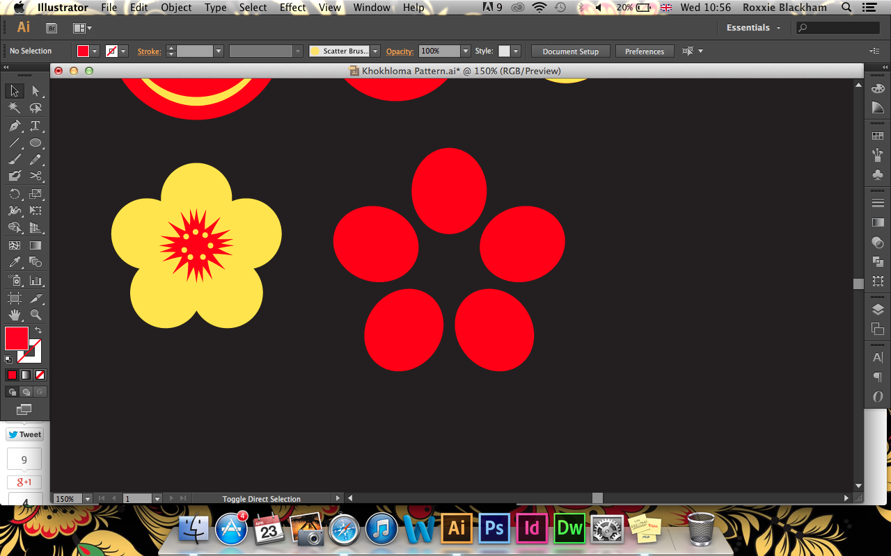
When it came to designing business cards, it was hard to think of an idea that incorporated a bit of everything. I didn't really want to just go for the logo colours as I had spent hours creating a Khokhloma pattern that I thought would work really well on the stationary!
I also thought about how the business cards could work as a set of individual cards..

I thought that the cards could be printed with a small part of the Kremlin roof on each card, so they could be laid out in a way that makes the full Kremlin. But I also thought that this might seem a bit cheesy..
Final Business Cards
My final business cards incorporated quite a lot of the Khokhloma pattern, with a simple contact side to the card so that it wasn't too overwhelming. These will be printed onto a textured, white stock with some pastel coloured stock sandwiched in-between each side of the card. The pastel colours will be similar to the colours found in the logo!
Printed Cards:
It took a few attempts in the digital dungeon to get some business cards that I was pleased with. The colour was off and for some reason the printer didn't like printing the pattern, and would replace it for either black or coral. I had to save my PDF as a JPEG to get it to print on those printers, which completely took away from the quality!

I also found that the printers in the digital dungeon printed my business cards a few mm smaller than I wanted them, as you can see in the image below..


To fix this problem, I printed a sheet of the pattern out, rather than trying to get them printed at the correct size, stuck all of the front sides onto several layers of pink and yellow stock (to create a sandwich effect) and then stuck these cards onto the pattern..


I was extremely pleased with the business cards that I produced, as they came out a lot better than I first expected them to, and the coloured edges really suited the brand.
Letterheads:
The letterhead was easy to design, as I basically used the business card layout, but in a letterhead style. I wanted the letterheads to go for the same duplex style, but they won't have a layer of pastel colour on the inside, as this will make the letterhead stock too heavy.
Printed Letterheads:
Even though I had booked a slot in the digital dungeon to print my letterheads, business cards, etc, when I went down there, everyone else was taking forever to print their work and there was only one person working! The printer down there also printed my pages out the wrong colour and too large, so I decided to give up and have a go at printing them myself in the studio, after wasting a lot of time and money..

Luckily, I've managed to print them out to a better standard than the printers downstairs! although, the ink won't sit on the paper completely and has been pulled off during the printing, I am much more pleased with these print outs than the previous ones.. PLUS the pattern printed out no problem, whereas the printers downstairs seemed to replace the pattern for a black square.


The Envelope:
The envelope for the letterhead was simple - I managed to find an envelope in the right colour, and used some of my vinyl stickers to brand it.

- Leave your comment • Category: brief 2 (505), OUGD505
- Share on Twitter, Facebook, Delicious, Digg, Reddit
After the crit, I proceeded to change the aesthetic of my chosen logo, as I was told that it didn't really reflect on the Russian influences that well. Instead, my logo was starting to look like a logo for a sushi bar or Japanese restaurant.
I also played around with a few name ideas for my logo - I wanted to use a name that sounded a bit more Russian and something that you could write using the cyrillic letters, but could be pronounced by a non Russian reader / speaker.
Final Logo:

I decided to use pastel and light colours for the logo, as I felt as though bold reds, blacks and yellows were a bit too much and didn't really compliment one another in a way that would work for a restaurant's logo. Also, when I showed the logo to my friend from Russia, she straight away recognised the images as roofs from the Kremlin!!
I think that the name "lie-kah" sounds a lot more Russian and is easier to read and pronounce than the previous name. The name came from the word "balalaika" which is a Russian instrument - I just chopped the word in half and used the more Russian sounding half, so it doesn't actually mean anything.
- Leave your comment • Category: brief 2 (505), OUGD505
- Share on Twitter, Facebook, Delicious, Digg, Reddit
- Leave your comment • Category: OUGD503, responsive
- Share on Twitter, Facebook, Delicious, Digg, Reddit
- Leave your comment • Category: OUGD403, responsive
- Share on Twitter, Facebook, Delicious, Digg, Reddit
The Individual Practice Brief Board is first in the ISSUU document, and the Collaborative brief is the last board..
- Leave your comment • Category: OUGD503, responsive
- Share on Twitter, Facebook, Delicious, Digg, Reddit


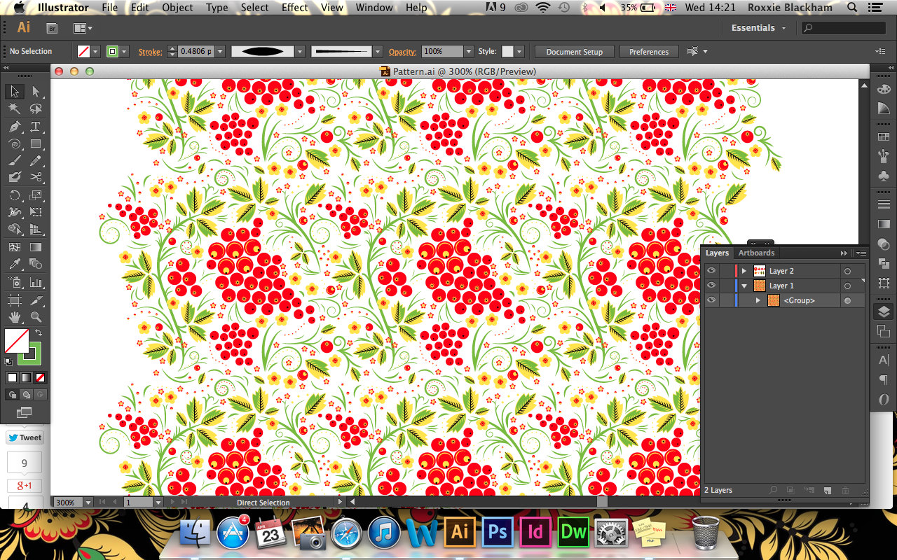


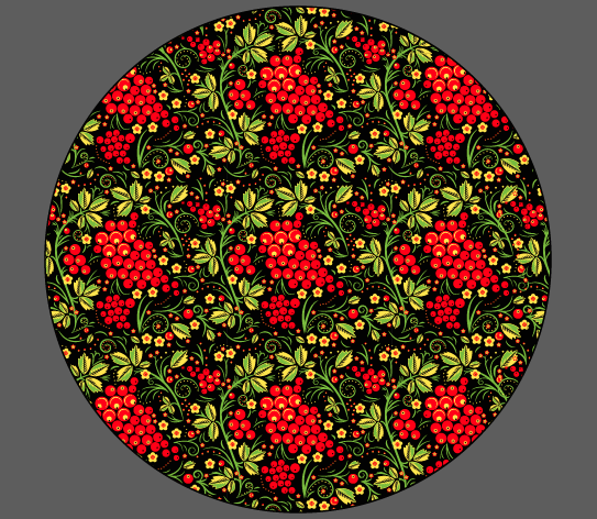
I was really pleased with the final outcome of the logo - it worked a lot better than I was expecting and I learnt a lot about Illustrator and creating patterns from dedicating a few hours to this. I also think that it will be easy to use this pattern with a variety of different stationary or even as decoration around the restaurant!
- Leave your comment • Category: brief 2 (505), OUGD505
- Share on Twitter, Facebook, Delicious, Digg, Reddit