
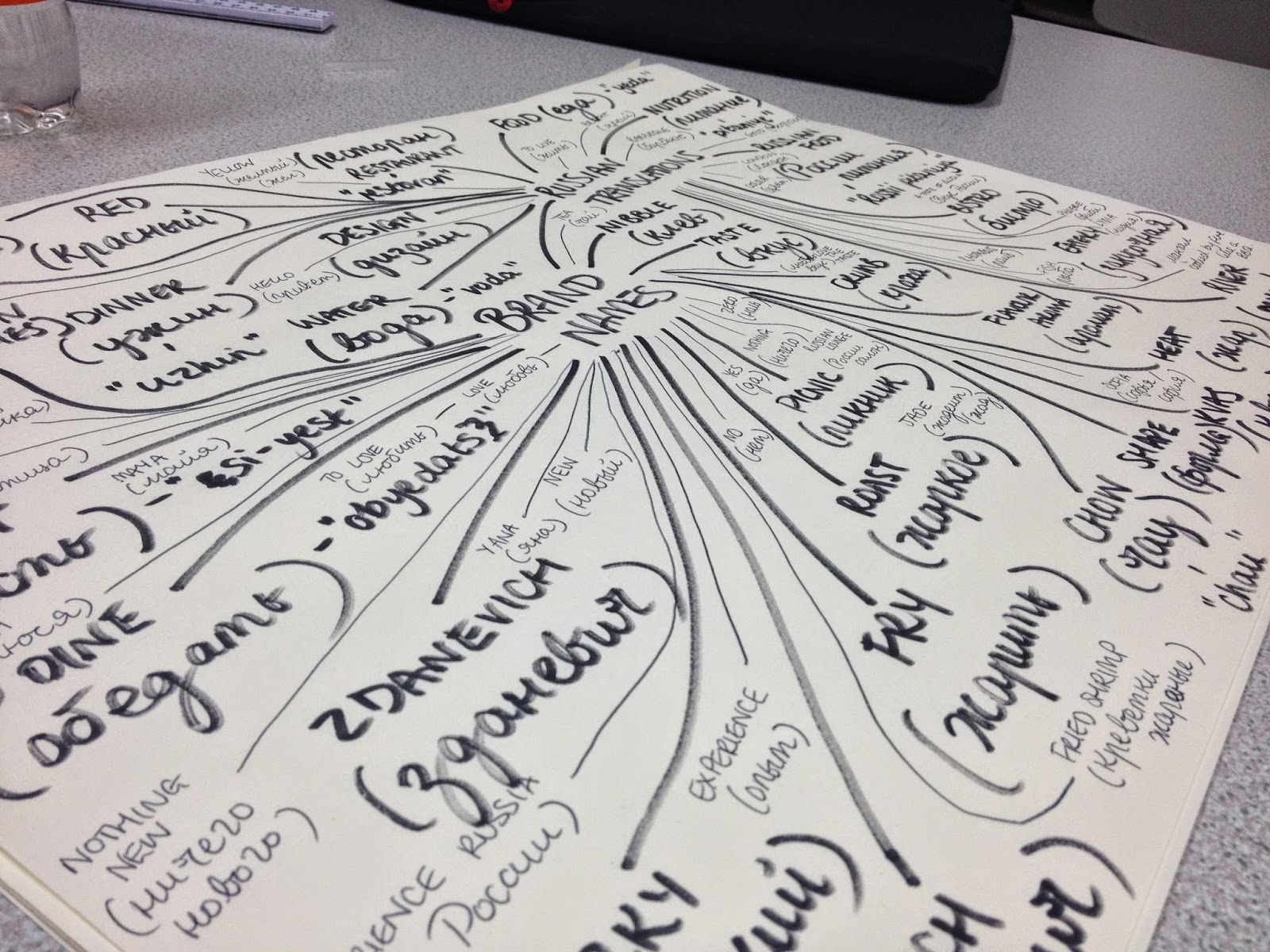
Coming up with a name for my restaurant was really difficult.. I wanted something short, catchy and memorable, yet it had to have some sort of Russian influence!
The annoying thing was that everything that sounded nice in English, was nowhere near as catchy when it was said in Russian!
I decided to work with the word шоко which is pronounced shock-oh, and comes from the Russian word for chocolate (шоколад). I liked this word, as it incorporated a very Russian looking character, as well as sounding like quite a trendy restaurant name that designers would probably want to go to!
When it came to designing the logo, I wanted to go for something simplistic, following colours that reflected the Russian Avant-Garde, but suiting the Russian restaurant. I don't want anything overly complex or highly illustrated - it needs to be clear, to the point and clever.
Whilst developing the logo ideas, I thought that the Russian restaurant could be mainly a fish restaurant, as a lot of their dishes include fish. This meant that I could incorporate a fish shape into my logo...
The colour scheme that I went for in the end was based upon the idea of the colour of salmon. When I tried making a salmon pink, it looked more like a translucent red, so I went for a more coral salmon pink, which could work in a lighter and darker shade.
The typeface that I have chosen to work with is called PT Serif. I looked at a variety of typefaces online - I needed to find something that used Russian Cyrillic Characters as well as English ones. PT Serif was my favourite typeface that I found as you could use both English and Russian characters, as well as a variety of different weights and styles.. Also, I loved the aesthetics of the typeface!


- Leave your comment • Category: brief 2 (505), OUGD505
- Share on Twitter, Facebook, Delicious, Digg, Reddit