Both James and I set out to come up with some different layout ideas and strap lines..
I started off by creating a mind map from words that describe each product, to help with creating strap-lines later on..

I then created some thumbnails, for layout ideas..

I created my strap lines from words used in the Product Descriptions on The Body Shop's website..


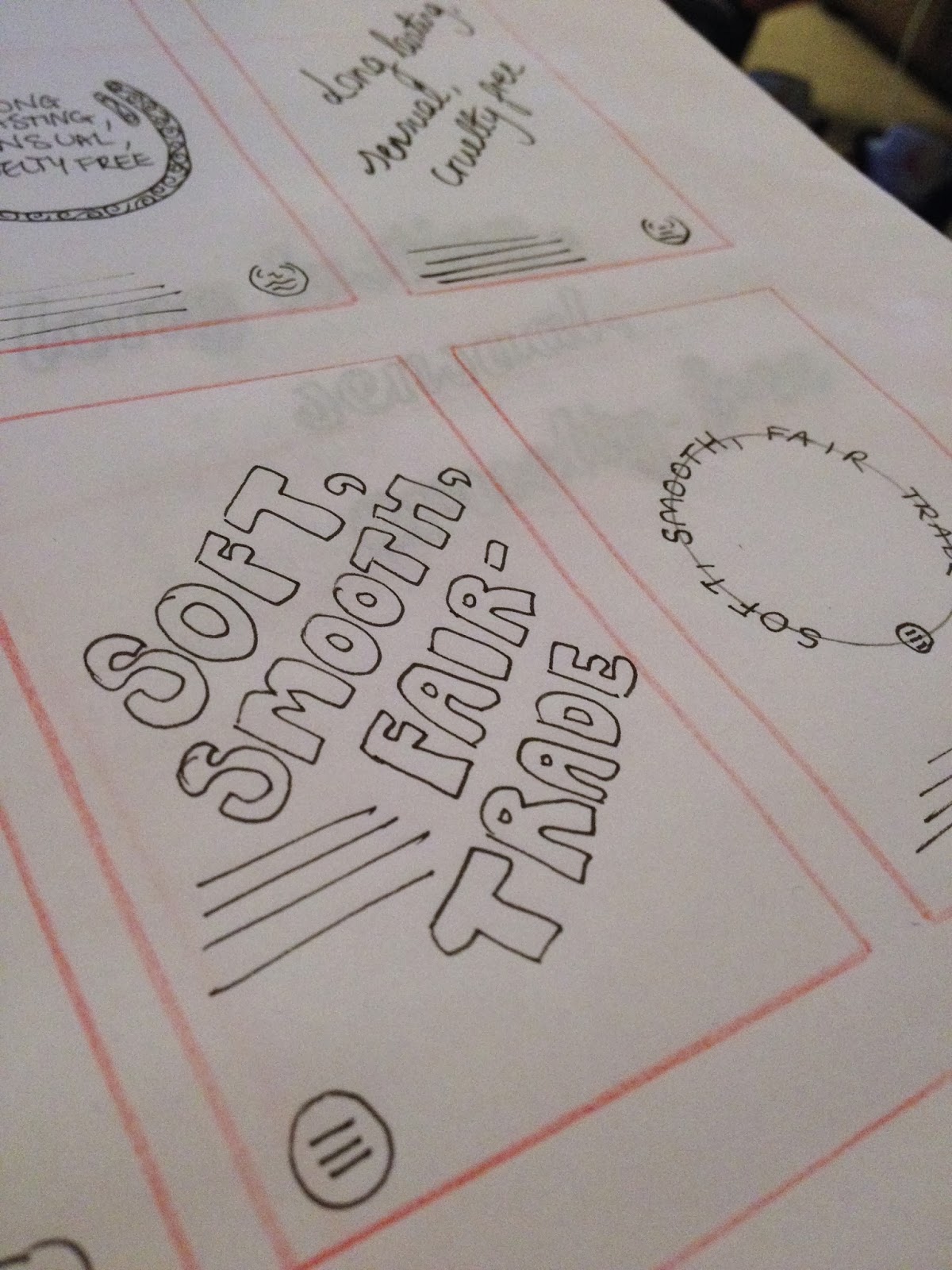


After producing small scamps, I decided to produce some larger ones to concentrate on a simple layout using a script style typeface..


I chose to work with a script font, as it was girly and suitable for The Body Shop, yet it wasn't too complex, so we could still quill around the shapes of the letters.

I met up with James on the 18th February to decide on our strap lines...
My strap lines:
Colour Crush:
luscious, rich moisture, intense colour
Body Butter:
Soft, smooth, fair trade
White Musk:
long lasting, sensual, cruelty free
Drops of Youth:
enhance, condition, natural origin
James' strap lines:
Colour Crush:
Crazy, sexy, crush
Body Butter:
Shea beauty with heart
White Musk:
Eau de sensual
Drops of Youth:
Smoother, fresher, healthier
We both thought that James' strap lines were more effective and playful, so we went with these for our main content on the posters.
Font Choice:
We wanted to use a sans serif typeface, so we thought about looking for a similar typeface to what The Body Shop already use within their posters..

Using whatthefont.com we found 5 matches for this typeface.. At first we thought that Solido Compressed Bold would work really well!

Until we found that you had to buy it for £40...

After looking at the font a bit closer, we thought that Bebas Neue was a much better match, plus it was free!!

We also thought about using the script typeface that Body Shop use on all their posters at the moment. We will use this typeface for product names, for example Body Butter..

Using whatthefont.com, we found a few matches, but they weren't anywhere near what we wanted!

We looked at Fugu typeface, by typographer Neil Summerour, however it wasn't quite right!!
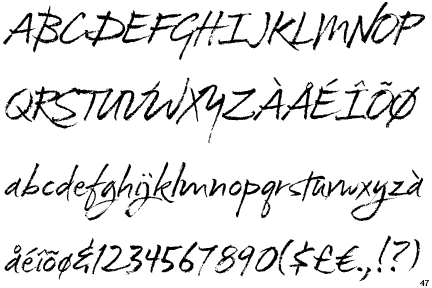
As we couldn't find this typeface anywhere online (without having to pay over £200!!) we decided to trace over the font on Illustrator so that we could use it..

Action Plan for the 19th February:
Produce various test pieces, to see how quilling works and how the layout could work with the chosen typefaces and strap lines!
- Digital layouts for printing
- Typographic test piece
- Practise making quilling shapes
- Gluing vs scouring tests
Using James' strap lines, I created various poster layouts on Illustrator, so that we had more of an idea of what we could use when it comes to our final poster layouts!
After chatting about the layouts together, we decided to work with...

We felt as though this style of layout for the posters was easiest to read and would be the most impactive when placed in a shop window!
- Leave your comment • Category: collaborative brief, OUGD503, responsive, studio brief 2
- Share on Twitter, Facebook, Delicious, Digg, Reddit