The Live Brief:
http://www.secret-7.com
I have decided to create a vinyl cover for Laura Marling's song The Beast.
Inital Ideas
My first intentions were to draw squiggly drawings of beastly creatures, as when I listened to her song, it was very indie and the folk music made me instantly think of rough drawings. However, when I started to research into Laura Marling's other album covers, I noticed she had already done similar things to what I had in mind...


So rather than creating something similar to what previous designers and illustrators had already produced for Laura Marling, I thought I'd try to take a slightly different approach. I think these kind of illustrations really suit her music, so I had a bit of a play around with fine liners and drawing Laura's face..

My first attempt was really poor. I did an extremely quick sketch of a portrait photo I came across of Laura Marling on the internet that I found quite intriguing. I thought I'd play about with different bright fine liners when producing this sketch. I think it could have worked if I had paid a bit more attention to it, however it was drawn in about 10 minutes so was very rough.

I then thought I'd try creating Laura's face out of lots of different lines heading in the same direction. I quite liked this sketch as it reminded me of the wave lines that sound makes when it is recorded. I also thought that it was a really different approach to the matter. However, I couldn't imagine this working as a vinyl cover at all, and it didn't really relate to the song.

I also attempted to draw Laura with brown hair, as there are a variety of photos where she has dyed her hair brown. I really don't think this drawing looks anything like her, but it was fun to mess around with the fineliner and see what I could come up with without a pencil!
After I did these 3 initial visuals of Laura's face, I thought I'd have a bit of a play with them in illustrator and see what they looked like as vector drawings.

I actually really like the way this drawing has translated when live traced. I think it gives it more of a broken and sketchy feel than the original image and is slightly more of what I was originally going for.

I do feel as though the original images look a lot better when in black and white and live traced, as it gives them a completely different feel.

I don't think that this image worked as well when live traced. It was harder to pick up the lighter yellow colours in the image and all the different coloured fine liners used confused the programme. However, I think it really suits her face and mouth.
I wasn't really sure on any of the vector images, so I thought I'd go back to free hand drawing, as I feel more comfortable with it and it always feels a lot more rewarding when I produce a good drawing for a final design.

I got seriously carried away with coming up with a sketch that suited my idea down to a t, and since I've uploaded this picture the drawing has been added to more and more to make it perfect. However, this is the design that I went from, and then proceeded to alter it in illustrator and see what kind of designs I could come up with!
6 COLOURS

GRAYSCALE

3 COLOURS

16 COLOURS

I played around with different types of live tracing on illustrator to see what the drawing would look like when manipulated through these simpler techniques. I really liked how the drawing came out when live traced in grayscale and 16 colours, as they looked really similar to the original sketch, but made it softer and subtly different.
I then decided to trace over the image by hand with the pen tool, and these were the results:

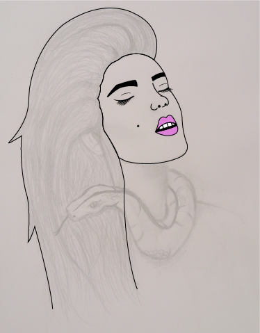


I spent a stupidly long time altering the smallest of details in the design, because every time I changed one thing, another thing would annoy me and look out of place. My biggest issue when designing this female figure, was that her mouth and nose took a lot of editing until they looked right. I am really happy with the final shape of the nose, however the mouth still irritates me. However, I managed to get the mouth as good as I could possibly make it, and have decided to try and not let it annoy me.
I decided to give the woman blonde hair, as it made her look more like all of the pictures of Laura Marling I have seen, and I also felt as though blonde hair was more goddess-like than dark brown. I also thought that the lips should be naturally red, yet with a bit of boldness to them, so that they look soft yet help to make the woman look glamorous and beautiful.
I felt like the snake needed to be darker green so that it stood out as something bad against the soft colours of the dreamy female. I played around with gradients a lot to give the drawing some depth so that it wasn't flat, and felt like this improved my design greatly.
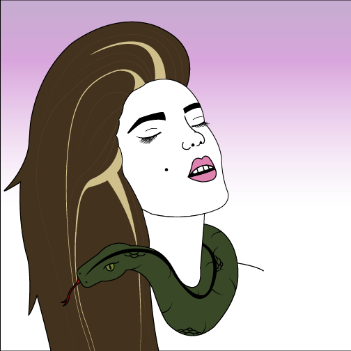
Final Design

I am really pleased with my final design, as it is completely different to anything I have ever produced before. I'm not much of a drawer or illustrator, and have never really created an illustration using the pen tool on Illustrator, so am actually proud of myself for being able to create something to such a nice standard. I love how the gradients have worked out in the design, and how the smallest of gradients make such a big difference (for example the snake's eyes or scales, or the small areas of peachy shadows on Laura Marling's skin). I also really enjoy the contrast between the violet sky and the blonde tones of the hair, and I think that the pinky violet colour that I chose in the end worked better than the blue that I had used before in my design development.
I definitely feel as though this design could be improved upon, and could easily spend hours and hours trying to make it perfect. However, I do think it would take me days to get it exactly how I envisioned, as I don't think I have the highest of pen tool skills on Illustrator, but designing this vinyl cover has definitely helped me to improve my Illustrator skills and I feel a lot more confident when using the pen tool and the gradient tool.
It could have possibly been a lot easier to create if my initial hand drawn sketch was a million times better, however I've always struggled drawing faces, therefore I am really pleased with myself for how well I have done, considering illustration is definitely one of my weaknesses!
I thought I'd challenge myself with this week long brief, and am happy that I did so as it has proved to me that I can do this kind of design if I put my mind to it.