First of all we tried crushing different colours and sticking them to the paper, but this just looked like a mess and didn't work out well at all!


Then I bought some Brusho powder inks, and we played around with these to see how they work..


At times the patters produced were really interesting, but too overpowering for the posters..

We also played with fabric dye (top) and black ink (bottom) to see how they differ from brusho ink..

We thought that regular ink with water just created a black mess and didn't look effective at all! So we scrapped that idea straight away!!


These trials were a bit crazy, but we quite liked the effect of them and wondered whether they could work as a poster..

We scanned one of the trials into the computer to see how it looked on the poster, and printed it out..

I loved the effect of this background, however with quilling it would just be too much and busy - it would take away from the poster and would end up in the wrong result..

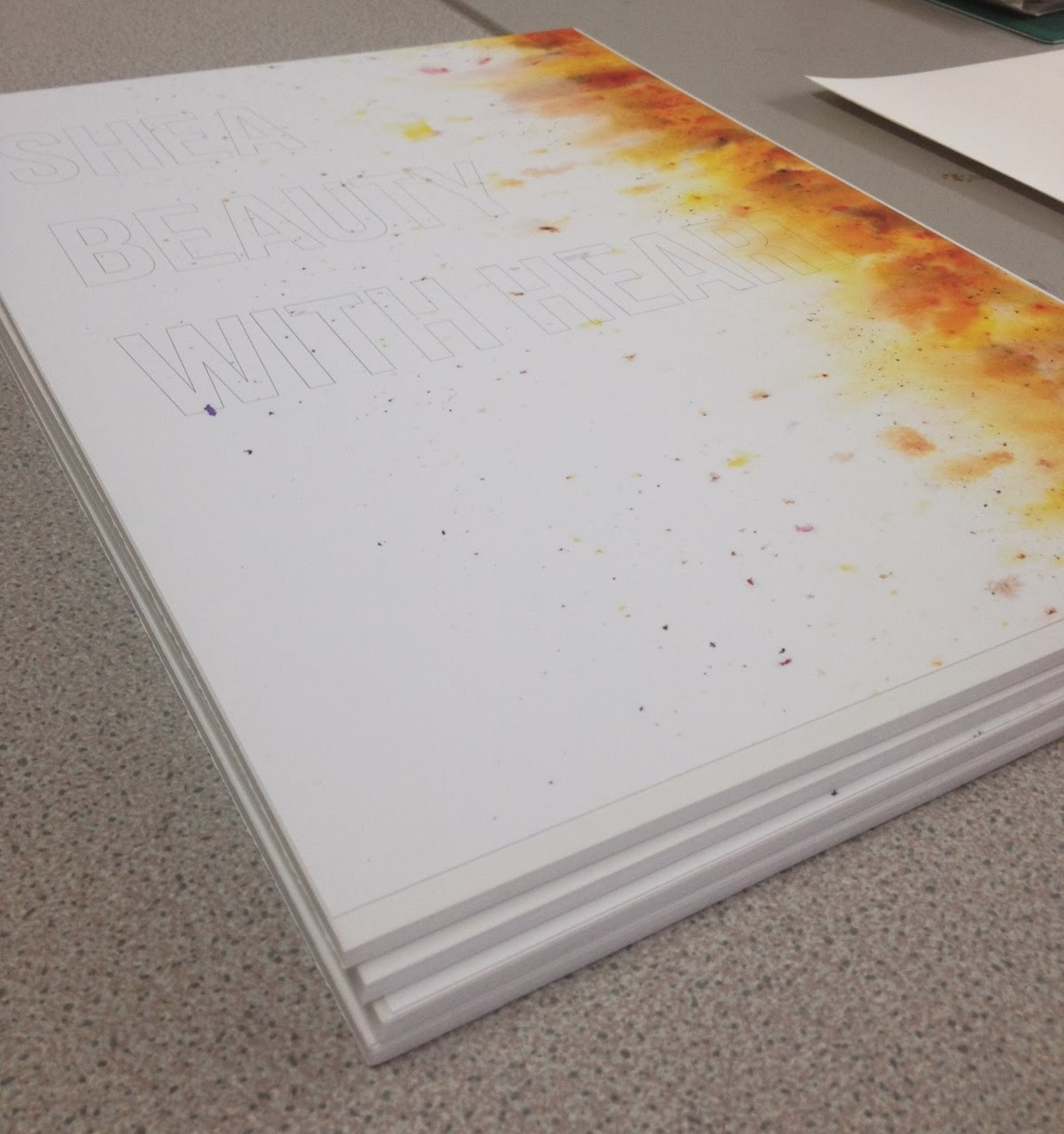
I took the brusho ink home and decided to try out spraying water on top of the brusho powder from the edge of the paper, to see how this could work as it means that there isn't too much going on at one time..


The ink ran all over the place and looked far too dark for the posters, so I used loo roll to blot the ink and make it paler and more Body Shop-esque..

I thought that the mess I made on the scrap paper looked really interesting and could possibly be used for something, but it was a bit irrelevant..

Scans from better background trials:


I also thought we could produce a similar effect for the campaign poster, using rainbow colours to represent the Gay Flag..

I sent the backgrounds to James and he produced the poster layout, ready for quilling..

We tried using the background on the left hand side of the layout first of all, but this didn't really work as it took up a lot of space that the type was sitting in..


The final poster layouts, ready for printing:
Body Butter


- Leave your comment • Category: collaborative brief, OUGD503, responsive, studio brief 2
- Share on Twitter, Facebook, Delicious, Digg, Reddit