What is type?
... Language
What is kerning?
The space between each letter.
Correct kerning is when you have equal space between each of the letters.
Identify the place where the biggest space is, for example between LW of RAILWAY.
You will then kern the rest of the letters to suit this space (never decrease the biggest space)
Never negative kern.
Kerning isn't used with every day design work.
Using your first name, correct the kerning.
The largest space in my name is between the two X's. This will be left at 0pt kerning.
The difference is only small, but it definitely looks different!
How do you break a sentence into two lines?
"It's not what you say, it's how you say it."
You should break sentences up into how you say it fluently.
Is it essential for a Graphic Designer to understand hierarchy?
... Yes
Hierarchy is really important in terms of showing information and layout choices.
Using the words 'one, two, three, four', make the viewer read from the bottom of the page upwards.
If you close your eyes and then open them for a second and close them again - "the blink test" - you will be drawn to the word 'one', because it has the most white space around it and is largest in point size.
Without changing the size or weight, make it read four, three, two, one.
This slightly works, but you can make the reading harder for the viewer by rotating words, as well as repositioning them. Our eyes are lazy and read the easiest words first. Our eyes hate reading words that are upside down!
For example:
Using text given, fill four pages with the type in 1 column, 2 columns, 3 columns and 4 columns..
What is the advantage of picking a typeface with a smaller x-height?
- It gives us more space
- It gives us the appearance that there is more leading
A typeface example with a small x-height is bembo
A typeface with a large x-height can be used to fill the page, e.g. Garamond or Gill Sans.
In theory, if you decrease the point size and increase the leading, you are still able to read the text. For example:
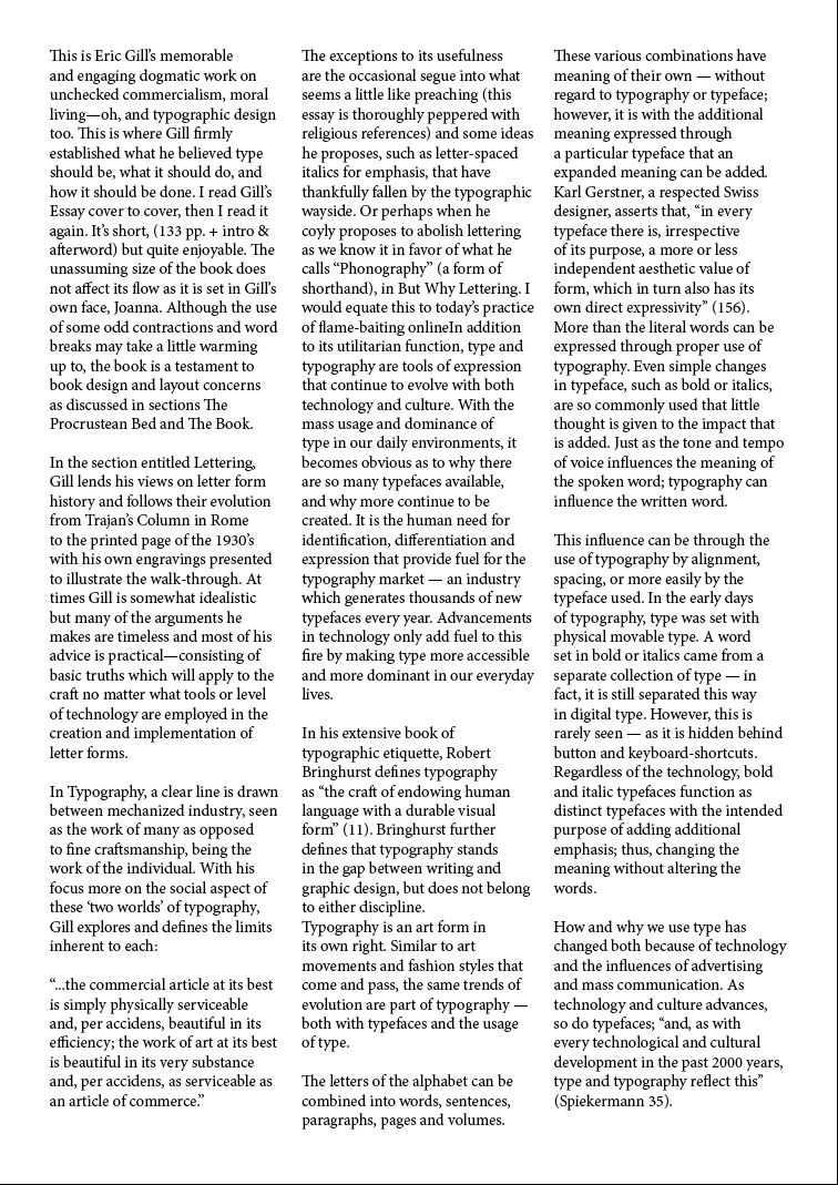
4 columns are usually seen within newspapers, 3 columns are used with magazines and novels or books often use 2 column widths.
How to make body cop more readable:
Leading - gives your eyes space to go back to the next line.
Point Size - Increasing the point size could be seen as patronising.
Paragraphs - Indent and line space paragraphs. Using indents makes the text look longer and makes it seem more serious.
Left-aligned - Used to reading from left to right, so makes it easier to read.
Justification - Justifying text adds on more lines of text by adding space between the words. This is always used within novels. Justification is not readable within 4 columns or less!
Gutter Space - The gutter helps to separate columns.
Word Count - The amount of words on one line should be between 6 and 12.
Minimum point size 8 / 9 pt.
Small print is often written at 6pt.


