OUGD504: Design For Print & Web Design Development - Colour Scheme
by Roxxie Blackham on Saturday, 28 December 2013
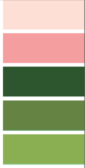
I have decided to work with the following colour scheme:

I chose to work with this colour scheme, as the shades of green were very similar to the shades used in the Kew Gardens logo. I also thought that the added extra of a pink colour would work well against the green, and compliment one another.
However, I have substituted the above shades of green for the Kew Gardens original logo shades of green:
I think that this colour scheme still works well - it just doesn't feel so 'pastelly'. I will also be using black and white within my colour scheme. I also thought about the fact I will probably use brown paper, so added this to the equation as well!

My Final Colour Scheme:
I decided to use shades of blue instead of pink, as they complimented the greens and browns better than the pinks did! They are also more neutral and I don't have to worry about the fact a lot of women don't like the colour pink!
