
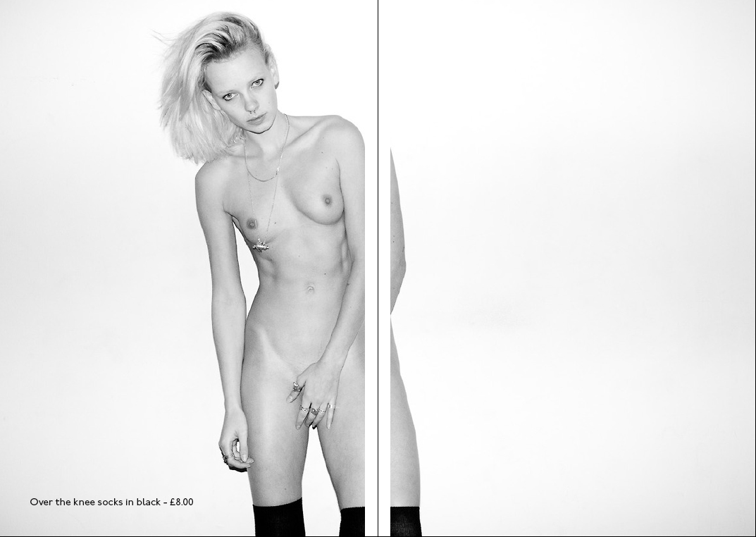
I have decided to work with a really simple design aesthetic, as I want to concentrate on the imagery. All of the images that I'm going to use within the publication have been selected from Jonathan Leder, American Apparel and Terry Richardson's photos to create quite an erotic, yet artistic publication.
I have decided to work with a pastel pink colour to reflect on the use of female bodies within the publication. I have also tried to use classy pictures on the outer pages and more erotic imagery within the french folds.


I decided to keep the contents page completely simplistic. Rather than including numbering for every page, I thought that it would be interesting to see how the publication works with just the names of the brands / photographers involved in the publication.

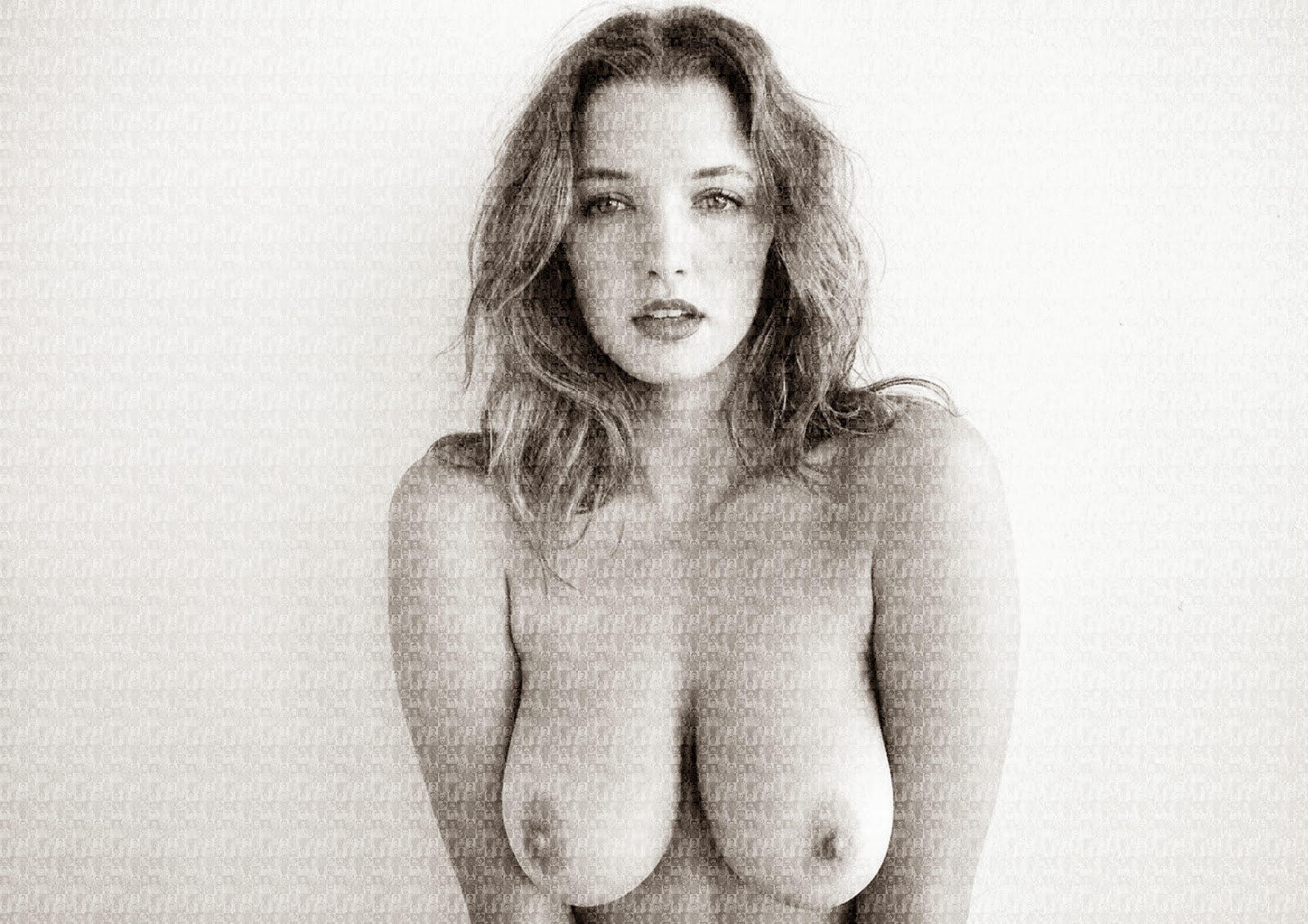
Within each "secret" double page spread, I want to use full bleed shocking images that are a bit revealing and in your face. I have decided to try to avoid being safe within the book design, and see how I can cause different reactions through the use of vulgar imagery, such as this photo by Richardson of a model's breasts.
I have moved the images to make room for the spine for japanese saddle stitching, so that the image isn't as obstructed by this method of binding.

I thought about stating who the photographers were within the pages, but then I thought I could try to make these "secret" images look like advertisements for American Apparel..

So I highlighted the necklace for sale..

When it came to the actual pages about American Apparel, I thought that I could highlight their controversy.
I think that the Terry Richardson photos work pretty well as a contrast to the American Apparel catalogue images as they look quite catalogue-esque with the white backdrops and focus on the models.
For each American Apparel page I've tried to match a Terry Richardson photo, to emphasise the sexualisation given to the women, this has also helped to bring continuity to the publication. For example..


The pose in the American Apparel image and the poses within the two images shot by Richardson are really similar. The only main difference is the fact that Richardson's model is stark naked! It's interesting to see how these images could actually be used to sell the little amount of clothing or jewellery that the featured models are wearing.
As I've decided to focus on American Apparel and Terry Richardson, I changed the image for the cover, which I definitely prefer anyway!
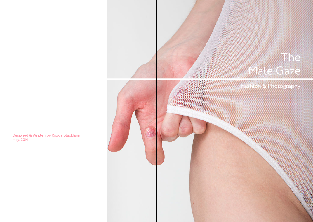
This image is more suiting for the publication and compliments the pink, white and black colour scheme.


I also thought about trying to create photo mosaics out of some of the images I used within the publication, so that I could print out some larger posters related to the publication..
I decided to work with black and white images for continuity and attention to the fine detail.


These posters will be printed out at A2 size to go along side the publication.
I decided to add text to the posters so that they were more relevant and relatable.


Poster Mockups


Close-up Shots of Printed Posters


I then went back to the publication and added some contextual information about American Apparel and this was the final publication:
Final Images Of The Publication:

At first glance, the book consists of pages about American Apparel and how they sexualise women in their fashion photography..


But at a closer glance, you notice that each page is in fact a folded page with hidden content inside the pages.
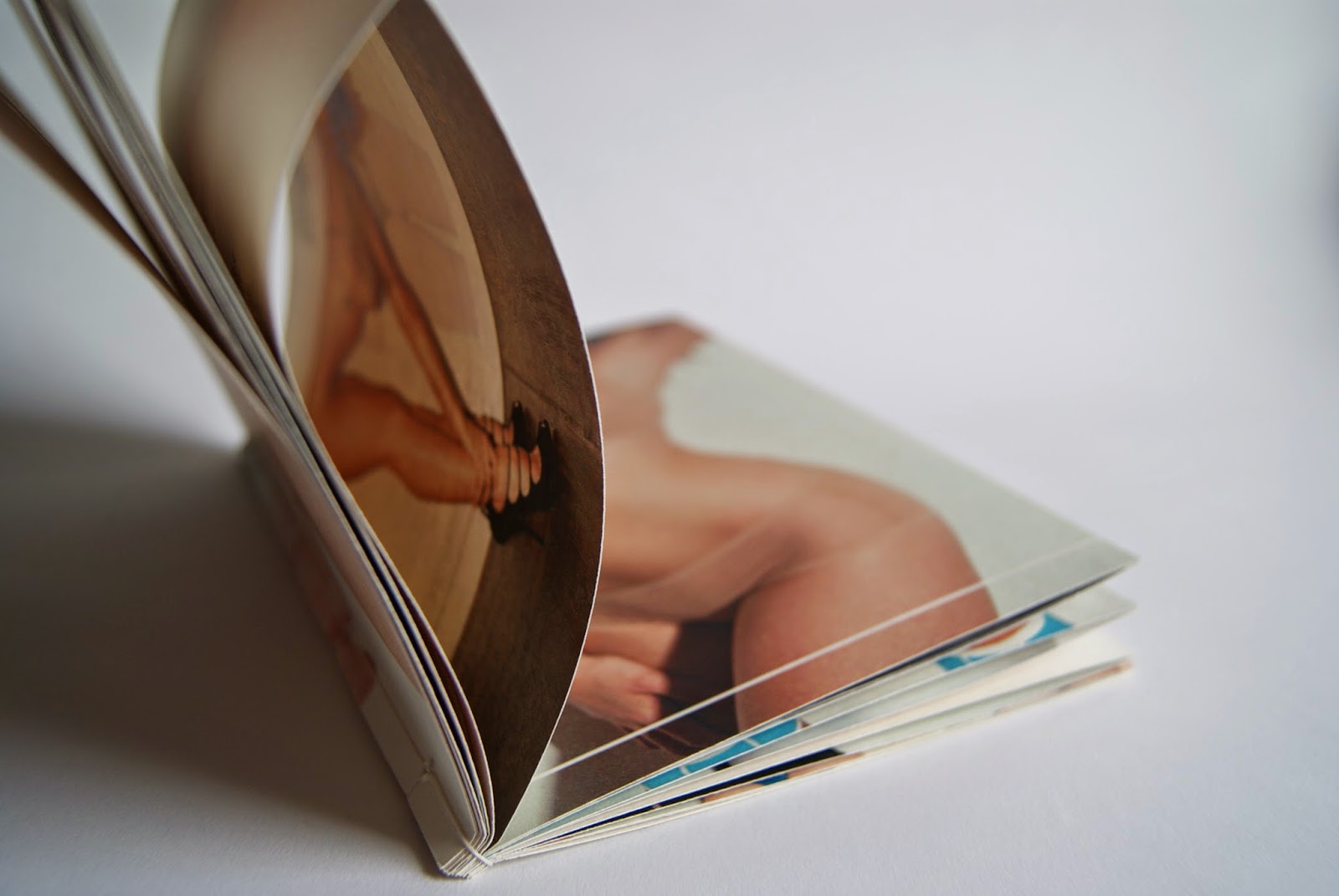
These pages can be ripped along the edge of the page (where the perforation is found), to reveal the more explicit images shot by Terry Richardson that follow a very similar theme to the American Apparel photos.
These pages have been designed to look like look book pages, showing off prices of products that American Apparel could sell, with added quotes about the male gaze.


The tearing of the page is to symbolise the 'deflowering' of the women within the publication and how their dignity and self opinion hasn't been considered.


I really love how when you tear the pages it leaves a rough effect to the edges. This helps to add a dirty feel to the publication.


I found out that in Russia, their business card dimensions are slightly different to ours in England, so I thought that it would make sense to design to these dimensions.
I also thought that I would use an existing address for my business cards, so that I didn't have to try and come up with something. I remembered that when I was in Shad Thames, the Zizzi restaurant was laid out really well inside and I preferred the interior to a lot of the other restaurants, so I thought that I'd use Zizzi's address - my restaurant could be replacing it in the future.
The Cardamon Building
31 Shad Thames, London, SE1 2YR
(020) 7367 6100


Business Card Ideas:
When it came to designing business cards, it was hard to think of an idea that incorporated a bit of everything. I didn't really want to just go for the logo colours as I had spent hours creating a Khokhloma pattern that I thought would work really well on the stationary!
I also thought about how the business cards could work as a set of individual cards..

I thought that the cards could be printed with a small part of the Kremlin roof on each card, so they could be laid out in a way that makes the full Kremlin. But I also thought that this might seem a bit cheesy..
Final Business Cards
My final business cards incorporated quite a lot of the Khokhloma pattern, with a simple contact side to the card so that it wasn't too overwhelming. These will be printed onto a textured, white stock with some pastel coloured stock sandwiched in-between each side of the card. The pastel colours will be similar to the colours found in the logo!
Printed Cards:
It took a few attempts in the digital dungeon to get some business cards that I was pleased with. The colour was off and for some reason the printer didn't like printing the pattern, and would replace it for either black or coral. I had to save my PDF as a JPEG to get it to print on those printers, which completely took away from the quality!

I also found that the printers in the digital dungeon printed my business cards a few mm smaller than I wanted them, as you can see in the image below..


To fix this problem, I printed a sheet of the pattern out, rather than trying to get them printed at the correct size, stuck all of the front sides onto several layers of pink and yellow stock (to create a sandwich effect) and then stuck these cards onto the pattern..


I was extremely pleased with the business cards that I produced, as they came out a lot better than I first expected them to, and the coloured edges really suited the brand.
Letterheads:
The letterhead was easy to design, as I basically used the business card layout, but in a letterhead style. I wanted the letterheads to go for the same duplex style, but they won't have a layer of pastel colour on the inside, as this will make the letterhead stock too heavy.
Printed Letterheads:
Even though I had booked a slot in the digital dungeon to print my letterheads, business cards, etc, when I went down there, everyone else was taking forever to print their work and there was only one person working! The printer down there also printed my pages out the wrong colour and too large, so I decided to give up and have a go at printing them myself in the studio, after wasting a lot of time and money..

Luckily, I've managed to print them out to a better standard than the printers downstairs! although, the ink won't sit on the paper completely and has been pulled off during the printing, I am much more pleased with these print outs than the previous ones.. PLUS the pattern printed out no problem, whereas the printers downstairs seemed to replace the pattern for a black square.


The Envelope:
The envelope for the letterhead was simple - I managed to find an envelope in the right colour, and used some of my vinyl stickers to brand it.

- Leave your comment • Category: brief 2 (505), OUGD505
- Share on Twitter, Facebook, Delicious, Digg, Reddit
After the crit, I proceeded to change the aesthetic of my chosen logo, as I was told that it didn't really reflect on the Russian influences that well. Instead, my logo was starting to look like a logo for a sushi bar or Japanese restaurant.
I also played around with a few name ideas for my logo - I wanted to use a name that sounded a bit more Russian and something that you could write using the cyrillic letters, but could be pronounced by a non Russian reader / speaker.
Final Logo:

I decided to use pastel and light colours for the logo, as I felt as though bold reds, blacks and yellows were a bit too much and didn't really compliment one another in a way that would work for a restaurant's logo. Also, when I showed the logo to my friend from Russia, she straight away recognised the images as roofs from the Kremlin!!
I think that the name "lie-kah" sounds a lot more Russian and is easier to read and pronounce than the previous name. The name came from the word "balalaika" which is a Russian instrument - I just chopped the word in half and used the more Russian sounding half, so it doesn't actually mean anything.
- Leave your comment • Category: brief 2 (505), OUGD505
- Share on Twitter, Facebook, Delicious, Digg, Reddit
- Leave your comment • Category: OUGD503, responsive
- Share on Twitter, Facebook, Delicious, Digg, Reddit
- Leave your comment • Category: OUGD403, responsive
- Share on Twitter, Facebook, Delicious, Digg, Reddit
The Individual Practice Brief Board is first in the ISSUU document, and the Collaborative brief is the last board..
- Leave your comment • Category: OUGD503, responsive
- Share on Twitter, Facebook, Delicious, Digg, Reddit