When it came to coming up with an idea for my Jack Nicholson poster, I was really struggling with ideas. I didn't want to create a poster using his face or film stills, as I felt as though this would have been a pretty obvious approach.
When I watched the film I looked out for memorable moments, and one part of the film that I seem to remember really well is a dream like scene when Jack Nicholson is lead in a sun-kissed field of orange and lemon trees.
I decided to play on the idea of these trees and create my poster around this memorable scene. I like this idea as it doesn't give away much of the film at all. I also felt as though the use of an orange and a lemon could play on the idea of identity within the film and how the two fruits look very similar - similar to David Locke and Mr Robinson in the film... It could be a reflection on the identity swap within the plot.

I decided to use a photo that I had taken of an orange tree before and play with the colours of it to see whether I could make it look like a lemon tree..


However, I felt as though this might not be exploring the idea that far..
So I played around with illustrating a lemon tree myself..


But when I tried using this in the background for my poster, it didn't really work and looked a bit messy and low quality..


The first pattern didn't really work as it was a bit distracting, so I decided to create something a bit more simple - more of a vector..


This vector still wasn't working for some reason.. I tried making vectors of lemons and oranges to incorporate both of the fruits and bring in another colour to play with..


Adding the oranges meant that I could play around with orange, yellow and white colours..


I quite liked the idea of using slices of lemons and oranges, as they have a really similar look about them..

The pattern seemed to work, but the film poster looked a bit too full on still! A bit too cluttered..


After messing around with the layout of the type, I thought about using less orange and lemon slices.. I scrapped the pattern idea and went with just one slice of each fruit..


I quite liked this effect, but they let like they were just centered for no reason, so I moved them over to the sides and voila!

I wasn't too sure about the layout of the type when it was used in conjunction with the fruit slices, so I moved it around a bit to see how it could differ..


I also altered a bit of the text and colour of the background slightly to make sure that I was using tints of already used yellows..

I decided to change the vector outlined fruit for actual images to make it juicier and more life like..


I still wasn't sure about the text.. It seemed like a bit too much for readability..


However I felt as though it was starting to look more like a book cover than a movie poster..

I had a go at putting an orange pip on the orange segment, to add to the poster and make it look a bit mysterious...

The orange pip looked a bit strange, but I quite like it! I think the typography might need altering slightly...


So I produced two mock-ups for the poster as well on Photoshop...

The colours have gone a bit weird since uploading onto here... I preferred the second mock-up as it suited the design more and was a bit cleaner than the first, it also incorporated the white bordered edges, unlike the first design..

What's strange is that the colours are normal when I uploaded the same jpg file onto Behance..

- Leave your comment • Category: brief 3 (505), OUGD505
- Share on Twitter, Facebook, Delicious, Digg, Reddit
OUGD503: Florence Lucy Fitness Banner Design Development
by Roxxie Blackham on Thursday, 3 April 2014
I was asked by a friend of mine called Flo to produce a banner design for her fitness blog online. She had already made a lot of the decisions, so it was a really simple and quick turn over!
First of all she drew a quick sketch to show me what she wanted in the layout, and what she had in mind..


She told me that she wanted to use a 'skinny' and 'hand-written' style typeface, so I sent her a few different ones to see what she preferred, using the information that she gave me..

Flo also had a little look online at different typefaces, and we played around with a few that she liked to see how these worked as well..

We ended up choosing the following typeface for her name, as Flo really loved the style of it and it suited what she was going for.

We thought that the typeface for the slogan should be slightly different and smaller..

I didn't like the ampersand from this typeface, so had a look at other typefaces and found the following two ampersands..

I also found a typeface that I preferred for the slogan..


After speaking to Flo, she decided that she preferred the quirky style ampersand, alongside the capitalised font called Moon Flower. She also said that she wanted the name to be bolder than the slogan..

Once we came to a decision with the typefaces, I moved the slogan around a bit to see how Flo preferred the layout..


I also thought that it would be interesting to see how colours could influence the design, even though Flo was reluctant to use colours in the typography..


After playing around with the first colours, Flo saw the potential of using colours in the design. She also decided that she liked the design when everything was left aligned.

We decided on the darker green for the colour, as it reflected her trainers.
Flo originally sent me the following photos to work from, as she wanted to use an illustration that reflected her in the banner - she asked for something that showed off gym gear or her trainers, or an illustration of her face..


However, considering the fact that I'm not exactly the greatest illustrator, I wasn't really sure what to do! We had a long discussion about what to do with her illustrations, and then thought that maybe we could use silhouettes of fitness women instead. I also created illustrations of trainers that were similar to the ones that she wears when she works out..


We both quite liked the way that the trainers were more prominent as there wasn't much detail within the silhouette of the woman. However, we thought that it looked a bit strange..

When I messed with the layout and the colours, it looked a bit better, but something was still wrong with it. Flo thought that the woman looked a bit static and didn't look right in the running position.
We thought that we could try working with a sideways plank position instead, but then we couldn't fit the trainers in properly, so I looked at some other gym positions online and thought about table top positions instead and how they would work better with the design..


I sent these to Flo, and she showed her brother who said "they look really sexual", but then she used the screen shot on her blog to see how it looked in context, and we both agreed that it suited the blog really well!


- Leave your comment • Category: OUGD503, responsive, studio brief 1
- Share on Twitter, Facebook, Delicious, Digg, Reddit


- Leave your comment • Category: OUGD503, responsive, studio brief 1
- Share on Twitter, Facebook, Delicious, Digg, Reddit
- Leave your comment • Category: OUGD503, responsive, studio brief 1
- Share on Twitter, Facebook, Delicious, Digg, Reddit


- Leave your comment • Category: OUGD503, responsive, studio brief 1
- Share on Twitter, Facebook, Delicious, Digg, Reddit

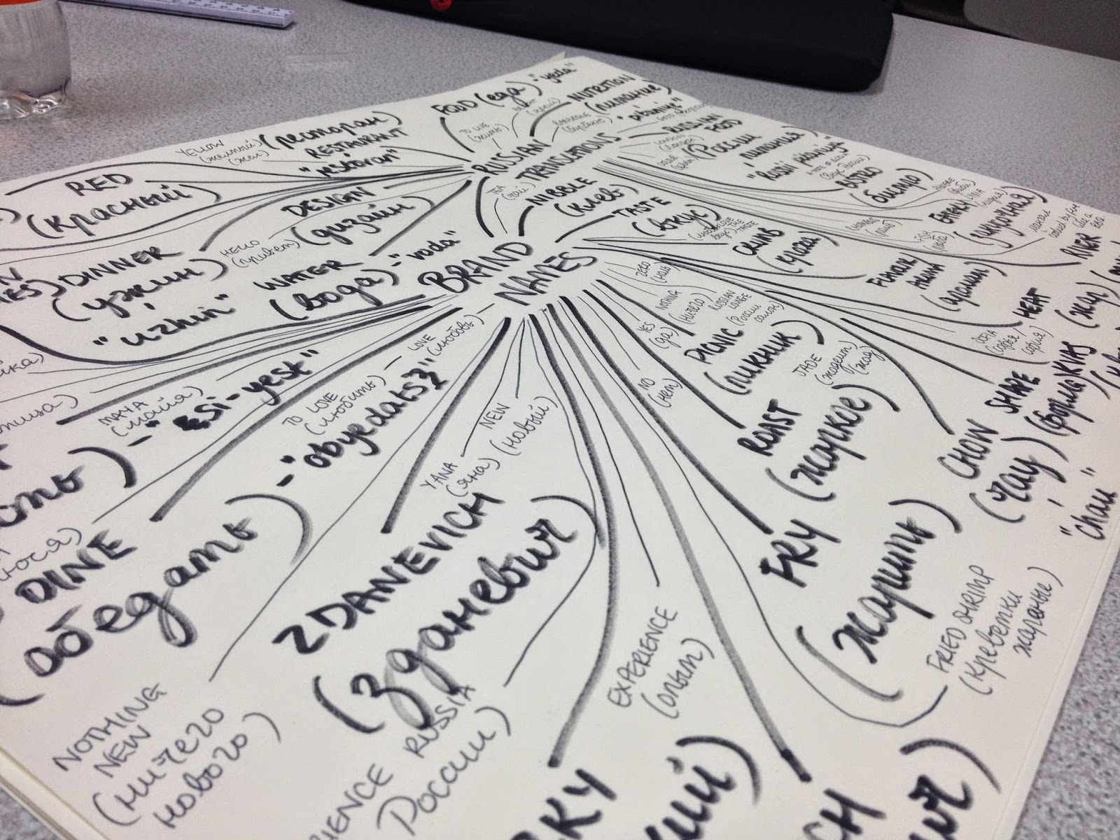
Coming up with a name for my restaurant was really difficult.. I wanted something short, catchy and memorable, yet it had to have some sort of Russian influence!
The annoying thing was that everything that sounded nice in English, was nowhere near as catchy when it was said in Russian!
I decided to work with the word шоко which is pronounced shock-oh, and comes from the Russian word for chocolate (шоколад). I liked this word, as it incorporated a very Russian looking character, as well as sounding like quite a trendy restaurant name that designers would probably want to go to!
When it came to designing the logo, I wanted to go for something simplistic, following colours that reflected the Russian Avant-Garde, but suiting the Russian restaurant. I don't want anything overly complex or highly illustrated - it needs to be clear, to the point and clever.
Whilst developing the logo ideas, I thought that the Russian restaurant could be mainly a fish restaurant, as a lot of their dishes include fish. This meant that I could incorporate a fish shape into my logo...
The colour scheme that I went for in the end was based upon the idea of the colour of salmon. When I tried making a salmon pink, it looked more like a translucent red, so I went for a more coral salmon pink, which could work in a lighter and darker shade.
The typeface that I have chosen to work with is called PT Serif. I looked at a variety of typefaces online - I needed to find something that used Russian Cyrillic Characters as well as English ones. PT Serif was my favourite typeface that I found as you could use both English and Russian characters, as well as a variety of different weights and styles.. Also, I loved the aesthetics of the typeface!


- Leave your comment • Category: brief 2 (505), OUGD505
- Share on Twitter, Facebook, Delicious, Digg, Reddit