


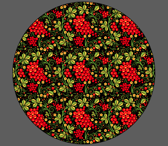
I was really pleased with the final outcome of the logo - it worked a lot better than I was expecting and I learnt a lot about Illustrator and creating patterns from dedicating a few hours to this. I also think that it will be easy to use this pattern with a variety of different stationary or even as decoration around the restaurant!
- Leave your comment • Category: brief 2 (505), OUGD505
- Share on Twitter, Facebook, Delicious, Digg, Reddit


Phil and Lorraine laid all of our work out onto the table so that we could see everyone's poster designs.


- Leave your comment • Category: brief 3 (505), OUGD505
- Share on Twitter, Facebook, Delicious, Digg, Reddit
We were asked to lay our work out for crits today and then give other people on different tables written feedback..
My feedback was as follows (for the logo that I had produced):


- I prefer the logos that are on the first page to the last ones on the colour choice board, I feel as though they represent 'Russian' more than the other one. And to go with that logo you could use the 'ok' symbol with it as a secondary logo?
- If you do use the other logo then yes, yes the symbol in the logo and also have it as a second logo.
- I like just the 'ok' by itself, the 'шоко' logo reminds me of a japanese restaurant like 'itsu' logo or a noodle bar. I don't know how it could be changed to relate it to a Russian restaurant.
- Don't think pronunciation is needed in the logo..
- I think that the hand rendered 'ok' in the logo works well, but with the 'ш' to reinforce the Russian
- When I read 'шоко', I read 'wok-oh' so maybe something else is needed. Is it too late to change the name now? However, I prefer the initial outcomes - much stronger and Russian like!
- Everything looks very Japanese - name, fish, etc the first logos much stronger!
- The logo variations on the first page look more Russian as opposed to the 'ok' logos on the colour choice page. The colours also work nicely.
- I don't think it needs pronunciation in the logo - maybe this is something you could include inside the restaurant, like in the menus.
- I don't know why, if it is a fish restaurant, the name sounds like chocolate.
- The logos on the 1st page are the most appropriate, however, it looks more Japanese than Russian.
- Could you include something like a palace roof or a matryoshka to make it more Russian?
- Leave your comment • Category: brief 2 (505), OUGD505
- Share on Twitter, Facebook, Delicious, Digg, Reddit
Whilst designing my logo for the brand, I thought about other ways I can tie the brand in together, and I thought about how I could include chalk boards within my designs..
I've recently gained a large interest in sign painting and so I thought I could incorporate this within my designs - this will bring in a bit of information and way finding design into my brief..
I've only ever painted onto a chalkboard once (for a valentine's present) and I used liquid chalk pens. However, I found that when you try to fill a block of colour in with these pens they become streaky or blotchy, for example....


I found out that they can pretty much produce everything that I want, but it comes at a price.. So I thought that maybe I should look a bit more into how I can paint on chalkboards and see if I could buy some paints and have a go myself!
I've decided that something like the menu could be sent off to be printed professionally, as it will need to be neat and the typography will need to be perfect! But for the sign outside of the restaurant, I could paint onto wood or chalkboard or anything..
- Leave your comment • Category: brief 2 (505), OUGD505
- Share on Twitter, Facebook, Delicious, Digg, Reddit
I found a website online which creates photo mosaics for you, so I thought that this would be worth trying out to see what it looked like..


I tried this test out with images already on my computer so that I didn't have to gather loads of images before testing.. I also found that once you created the mosaic you could change the merge value so that it looks closer to the original image and has more detail!

I quite liked this way of working around my problem, however I had the issue of the image being low quality.. I'm going to have to create it myself..
I found a few tutorials online to make a photo mosaic on photoshop, so I thought that I'd follow one of these and see how that works out!


I was really impressed with these results as I managed to create something that looked like the original painting from afar, but when you look closer you can see loads of faces staring back at you!
I then proceeded to apply the mosaic pattern to the rest of the images that I had chosen. I decided to work with 3 landscape and 2 portrait images, all from the classical era of paintings so that they work as a set of posters.
Final Images For Posters


Ideas:
- photo mosaics of classic painting made up of men's faces
- photo mosaics of photos of women
- comparison between photos of an erotic nature and catalogue photos
- french folding - could be used for secrecy (erotic photos)
- publication
- look book style
- questioning morals and feminism
- Jonathan Leder, Terry Richardson